


WORKS · KFME DIGITAL EDUCATION CENTER
Learning
while running a shop
Renewal proposal for the KFME Education Center website of the Korea Federation of Micro Enterprise. Course application, classroom booking, learning, and mileage were redrawn as one phone flow.
Shutter goes up when you scroll
Main draft A · apply quick-menu typeOn the right of the first screen, 「Apply for a course」 and 「Book a classroom」 are fixed large.
01 / OVERVIEWIntroduction
It is not about changing the design, but about making the application finish on a phone.
The KFME Education Center is the Digital Education Center of the Korea Federation of Micro Enterprise. One website serves everyone from people preparing to start a business to owners running a shop to groups and instructors wanting to book a classroom.
The renewal proposal covered a full renewal of the website, a landing page, classroom and facility booking, learning management (LMS) running from course application through payment · VOD · progress · attendance · completion · satisfaction survey, and mileage.
There was only one question we had. Can a business owner who is busy working for a living complete training applications and rental reservations from a mobile phone?
- 4User Type
- 5Services bundled into one membership system
- 3Main drafts
- 6Sub screens
- 12030 scroll landing page
Four people using one website
- 01Prospective/early founder
Choose an industry and find basic start-up courses. Many people first sign up for a free course.
- 02Owners running a shop
Digital transformation and marketing practice in short VODs, learned on the phone after the shop closes. Many are in their 50s and 60s.
- 03Groups and instructors booking
Check free times for classrooms and studios, book one, and get the approval result as a notification.
- 04Education Support Team Operator
Admin runs courses, spaces, and policies directly, and approves applications and bookings on one screen.
02 / TASKSThree tasks
There were three things to solve
Getting small business owners busy with their livelihood to finish a course application and a room booking on their phone. We split this one sentence into three directions.
-
01
All the way from your phone
Large text, less typing, three choices. So the application never stalls midway.
choose Press Done -
02
Rental is online
Move rental applications and approvals that were received offline to one screen on the calendar.
Free time Reservation application Approval notification -
03
One flow from application to completion
Application → payment → learning → completion → mileage, linked in one member system.
application payment learning completion mileage


03 / A DAYGaps in the day
Learning comes into the
gaps of the day.
Before drawing the screen we assumed one day in the life of a café owner. Before the shutter goes up, a dead afternoon, the night after the shutter comes down. Each gap allows different things.

08:30
Before the shutter goes up
Scan courses starting this week and apply right away
KFME
Courses starting this week
Tax basics and VAT reporting · 2 seats left
Apply for a course
15:00
Afternoon with no customers
Continue yesterday's lecture at 1.25x speed
KFME
My classroom
Lesson 3 of How to manage delivery app reviews
Continue watching

22:00
After the shutter comes down
Check free classroom times and book a room
KFME
Classroom booking
Main hall · March 11 (Thu) 13~14
✓ Received
This is the assumed day for design purposes. This is not the result of actual user research.
04 / LOGOLogo and red
Red is only on the M
KFME is the English name of the Korea Federation of Micro Enterprise. Three of the logo's four letters are navy.
Only one letter is red. M, Micro. It is the word for small business. We read this red as the owner's own place.
So on screen, too, red is used only where the owner taps, only on apply actions such as 「Apply for a course」. Everything else is KFME Blue.
Red covers 0.76% of one Main draft A page. Small, but it sits where the owner's eyes land first.


05 / COLORColor
Two colors,
six roles
There are two standard colors set by the institution: KFME Blue #09255A and KFME Red #E60020. The design draft started from these two and divided roles down to secondary blue, light background, two text levels, dividers, and status colors.
Contrast ratio stays at 4.5:1 or higher, and states use text and icons together, not color alone.
palette
-
Primary color KFME Blue
#09255Argb 9 37 90Header, title, main button, hero background
-
stress KFME Red
#E60020rgb 230 0 32Only on apply actions such as 「Apply for a course」
-
assistance secondary blue
#2457B8rgb 36 87 184Link · selected state
-
background light background
#EAF0FArgb 234 240 250Card · Section Background
-
background page background
#F5F8FDrgb 245 248 253page background
-
letter text
#1B2232rgb 27 34 50body letters
-
letter supplementary letters
#5D687Crgb 93 104 124Description · date
-
line contour
#D3DCEBrgb 211 220 235Column gap · input border
-
situation Available · Completed
#1F8A5Brgb 31 138 91Booking available · completed · done
-
situation Waiting · almost full
#C77700rgb 199 119 0Waiting · closing soon
Red covers 0.76% of Main draft A
- White background48.91%
- Light background18.85%
- KFME Blue14.85%
- Photos, etc.10.43%
- Text2.69%
- Divider2.53%
- Secondary Blue0.97%
- KFME Red0.76%
Pixel counts from the Main draft A design (1920 × 3404), each pixel assigned to the nearest palette color. Pixels outside a color distance of 38 are grouped as photos and so on.
A pair that can carry text
| Swatch | Text color / background color | Contrast | Result |
|---|---|---|---|
| Aa | #FFFFFF / #09255A White text / KFME Blue |
14.74:1 | OK even for small text |
| Aa | #FFFFFF / #E60020 White text / KFME Red Note: apply button text |
4.78:1 | OK for body text |
| Aa | #E60020 / #F5F8FD KFME Red / page background Note: threshold value, bold text only |
4.49:1 | Large text only |
| Aa | #E60020 / #09255A KFME Red / KFME Blue Note: never red text on navy |
3.07:1 | Large text only |
| Aa | #2457B8 / #FFFFFF Secondary blue / white background Note: link |
6.70:1 | OK for body text |
| Aa | #1B2232 / #F5F8FD Body / page background |
14.92:1 | OK even for small text |
| Aa | #5D687C / #F5F8FD Secondary text / page background |
5.27:1 | OK for body text |
| Aa | #1F8A5B / #FFFFFF Available · Completed / white background Note: bold with an icon |
4.33:1 | Large text only |
| Aa | #C77700 / #FFFFFF Waiting · almost full / white background Note: bold with an icon |
3.46:1 | Large text only |
situation
- Booking available
- Closing soon
- Selected
- Closed
Rather than distinguishing states by color alone, use text and icons together.
06 / EASY-UXEasy screen
Bigger, less typing,
done in three
We set five principles so that owners in their 50s and 60s can finish an application on their own.
-
Tax basics and VAT reporting
3.11 (Thu) 14:00 · main hall
2 seats left
Apply for a course -
Tax basics and VAT reporting
Main hall · 2 seats left
Save courses of interest Share About the instructor Curriculum Apply for a course -
NameHong○○
Contact Information010-****-1234
IndustryFood service
✓ Filled in from your member details
Required Items 3 / 5
-
Course registration
Apply for a course
Words on the button
- Apply for a course
- Book a classroom
- Continue watching in My classroom
- Get course news
-
Your application is complete
What to do nextCheck course materials in my classroom
Tax basics and VAT reporting
3.11 (Thu) 14:00 · main hall
2 seats left
Apply for a course
Tax basics and VAT reporting
Main hall · 2 seats left
Save courses of interest Share About the instructor Curriculum Apply for a course
NameHong○○
Contact Information010-****-1234
IndustryFood service
✓ Filled in from your member details
Required Items 3 / 5
Course registration
Apply for a course
Words on the button
- Apply for a course
- Book a classroom
- Continue watching in My classroom
- Get course news
Your application is complete
What to do nextCheck course materials in my classroom
07 / MAIN DRAFTSThree main drafts
Same menu,
three first screens
All three kept the logo and menu structure the same and differed only in how the first screen is laid out. We scrolled each page to the end to see what caught the eye first.
And we compared them on the same criteria. To start an application, Draft A takes one tap and Drafts B and C take two.
We centered on Draft A and moved four good parts from B and C.
- B → AEducation field picture card
- B → AWeekly class schedule
- C → ANews filter
- C → AMain number · directions group
On the right of the first screen, 「Apply for a course」 and 「Book a classroom」 are fixed large.
The center is introduced first with the single line “Growing Together.” and picture cards for seven fields.
Calmly list the fields with sentences on the left and class photos on the right.
CriteriaABC
Steps to start an application1 tap2 taps2 taps
Steps to start a room booking1 tap1 tap1 tap
How clear is the first choiceHighMediumMedium
One screen, one actionYesPartlyPartly
08 / MAIN AMain draft A
Main draft A · apply quick-menu type
TWO DOORS FIRSTTwo doors on the first screen, and below them an easy order to choose from
Applications and bookings start from the two doors on the right of the hero, and scrolling down continues through courses starting this week · fields · industry recommendations · popular courses · video · classroom booking · questions and consultation · sign-up, in that order.
- Body at least 18px, button height at least 48px
- 「A+ large text」 in one tap, body text at 120%
- Free, paid, online and offline as letter badges
- Seats left and closing soon in color and text
- 01Opening screen
Two doors, 「Apply for a course」 (red) and 「Book a classroom」 (white), with 「Continue watching in My classroom」 and 「Get course news」 below them.
- 02Courses starting this week
Courses starting within 7 days are shown right away with free/paid, online/offline badges and seats left.
- 03Field · my industry
Course counts per field as numbers, and picking your industry recommends matching courses.
- 04Watch the video first
People watch a short video of the course first, then choose a course.
- 05Classroom booking
The main hall, classrooms, and studio link straight to booking from a single-line banner.
- 06Sign-up and mileage
Sign up with Kakao and mileage adds up as you learn.
09 / SCREENSSub screens
From application to operation,
six screens
The people choosing a course, the people renting a classroom, and the staff who handle all of it were drawn with the same rules.
01 / 06
-
 01 Course DetailsApplication details follow you as you scroll
Date, place, capacity and seats left, completion criteria and fee, and 「Apply · Pay」 follow on the right. At the top are three steps: course → details → payment · completion.
-
 02 Room bookingPick a space and the calendar opens right away
Main hall · Classroom 1 · Classroom 2 · Studio tabs, showing available · partly available · full · closed in both color and text. When you pick a time slot, 「13:00~15:00 Request booking」 appears on the button.
-
 03 MobileOn mobile phones, three screens are enough.
Two doors on the main screen, auto-fill and mileage deduction in steps 2/3, and continue watching and progress in My classroom.
-
 04 My pageWhat you learned and what you earned, in one place
Courses in progress · completions · mileage balance at the top; progress, certificates of completion, and the mileage ledger below.
-
 05 Admin integrated booking calendarA week for the booking staff
On the space × weekday table, tap a waiting booking to approve it, or select several and approve at once. The staff only picks a reason for rejection, and the result goes out as a KakaoTalk notification.
-
 06 Admin dashboardFrom what to do today
The top gathers the four items — bookings waiting for approval · waiting-list responses · completions to decide · refund requests — and below are this week's courses, application trends, and the satisfaction survey response rate.
The names, courses, schedules, and numbers on the screen are all examples to show the structure.
10 / THREE TOUCHESThree choices
An application takes
three choices
We carried over the phone scene from the 2030 landing page design draft as it is. Choose, tap, done. Learning and mileage after that are one-screen flow.
-
Choose,
Courses starting this week are visible right on the first screen.
Owner Hong○○,
What shall we learn today?Search by course name or field
Courses starting this week
 Tax basics and VAT reporting3.11 (Thu) 14:00 · 2 seats left
 Smart store launch in practice3.9 (Tue) 19:00 · 6 seats left
 How to manage delivery app reviewsVOD 6 lectures · always availableHomeCoursesBookingMy classroomMY
-
Tap,
One quick sign-in fills in your name and contact details.
Tax basics and VAT reporting3.11 (Thu) 14:00~17:00Main hall · 2 seats leftNameHong○○
Contact Information010-****-1234
IndustryFood service
Payment amountKRW 30,000
Use mileage−2,000P
Final paymentKRW 28,000
Pay KRW 28,000 and apply -
Application done.
Application results arrive right away as a KakaoTalk notification.
KakaoTalk notification[KFME Education Center] Your application for Tax basics and VAT reporting is complete.
Your application is complete
CourseTax basics and VAT reporting
Date and time3.11 (Thu) 14:00
LocationMain hall
Go to my classroom -
I listen to it whenever I have time,
With 1.25x speed and continue watching, they keep learning without a break even in a short gap.
08:41 / 14:00VOD 6 lectures How to manage delivery app reviewsLesson 3 · How to reply to malicious reviews
1.25x speedRepeatSubtitlesCourse progress rate62%
- Lesson 1: How reviews affect sales
- Lesson 2: Service that earns good reviews
- Lesson 3: How to reply to malicious reviews
- Lesson 4: Fixing the menu with review data
-
Learning adds up.
Mileage earned from completion and survey responses can be used to pay for paid courses.
Mileage you can use
2,300P

Completion earned +2,000P
- 3.08.
Completion: How to manage delivery app reviews
+2,000 - 3.05.
Payment: Tax basics and VAT reporting
−2,000 - 3.02.
Survey response
+300 - 3.02.
Completion: Smart store launch in practice
+2,000
Mileage can be used only to pay for paid courses at the center.
- 3.08.
Owner Hong○○,
What shall we learn today?
Search by course name or field
Courses starting this week
Tax basics and VAT reporting3.11 (Thu) 14:00 · 2 seats left
Smart store launch in practice3.9 (Tue) 19:00 · 6 seats left
How to manage delivery app reviewsVOD 6 lectures · always available
HomeCoursesBookingMy classroomMY
Tax basics and VAT reporting3.11 (Thu) 14:00~17:00Main hall · 2 seats left
NameHong○○
Contact Information010-****-1234
IndustryFood service
Payment amountKRW 30,000
Use mileage−2,000P
Final paymentKRW 28,000
Pay KRW 28,000 and apply
KakaoTalk notification
[KFME Education Center] Your application for Tax basics and VAT reporting is complete.
Your application is complete
CourseTax basics and VAT reporting
Date and time3.11 (Thu) 14:00
LocationMain hall
Go to my classroom
08:41 / 14:00
VOD 6 lectures
How to manage delivery app reviews
Lesson 3 · How to reply to malicious reviews
1.25x speedRepeatSubtitles
Course progress rate62%
- Lesson 1: How reviews affect sales
- Lesson 2: Service that earns good reviews
- Lesson 3: How to reply to malicious reviews
- Lesson 4: Fixing the menu with review data
Mileage you can use
2,300P
Completion earned +2,000P
- 3.08.
Completion: How to manage delivery app reviews
+2,000 - 3.05.
Payment: Tax basics and VAT reporting
−2,000 - 3.02.
Survey response
+300 - 3.02.
Completion: Smart store launch in practice
+2,000
Mileage can be used only to pay for paid courses at the center.
- Touch 1
- Touch 2
- Touch 3
Free course, paid course, rental reservation, all three steps
| flow | Step 1 | Step 2 | Step 3 |
|---|---|---|---|
| Free course | 「Courses starting this week」 · Apply for a course | Course details — schedule · seats left, Apply | Check auto-fill → Application complete |
| Paid Course | Choose a course | Course details → Apply · pay | Use mileage → Payment |
| Room booking | 「Book a classroom」 | Choose a space → date · time | Purpose · people → Request a booking |
-
Free course
Step 1「Courses starting this week」 · Apply for a course
Step 2Course details — schedule · seats left, Apply
Step 3Check auto-fill → Application complete
-
Paid Course
Step 1Choose a course
Step 2Course details → Apply · pay
Step 3Use mileage → payment
-
Room booking
Step 1「Book a classroom」
Step 2Choose a space → date · time
Step 3Purpose · people → Request a booking
So nobody is cut off, even without an account — tapping apply opens a Kakao · Naver · Google quick sign-in, and after signing in you return to the same step. The only extra details asked on first sign-in are industry and contact number.
11 / ONE BOOKINGOnly one booking
Tap at the same moment,
only one booking is saved
Room booking means moving the applications and approvals once taken offline onto an online calendar. Once it is online, two people can tap the same time at once.
Even if the screen shows “available,” two taps at the same moment can overlap. So the screen serves only as an auxiliary.
The first request locks the space · date rows, checks that no booking overlaps, then saves. The second request waits until the lock is released.
The second request, which takes over the lock, finds the spot already saved and is recommended another time along with “Someone else just applied.”
The final guarantee comes from the database. Because of the unique constraint that allows only one row per slot, whichever path a booking comes in, only one remains for that slot.
- TimeRequest ARequest B
- t1Take the lockWait for the lock
- t2No overlap → save the slotWait
- t3ReceivedTake the lock
- t4—Found an overlap → recommend another time
- 1Screen
AuxiliaryTimes are checked again when a slot opens and just before applying, so a time already taken cannot be picked. The screen is not used as the basis for blocking.
- 2Lock
SELECT … FOR UPDATELock the space and date rows, check for overlapping bookings, then save. The second request that waited is told, “Someone else just applied.”
- 3Database
UNIQUE(space, date, slot)Bookings are stored per slot, so the same slot keeps only one booking whether it comes from admin entry, simultaneous requests, or a resend.
- +request key
idempotency keyRepeated button taps and resubmits after a refresh are filtered by the request key, so the same application is never saved twice.
From application to approval information, all on one calendar screen
- userChoose a space
Compared by photo, area, and capacity
- userChoose a free time
Date and time slot on the calendar
- userReservation application
Enter purpose and number of people, confirm right away
- Staff in chargeApprove · reject
Just pick the reason for rejection
- automaticNotices
Received · approved · rejected · cancelled · notice the day before
Received→Approved→Use completeReject · cancel
Slots are taken from the moment of receipt, so no other application can overlap while approval is pending. Booking stays a separate system not tied to payment or mileage, sharing only member details.
Example policy settings
- reservation unit
- 30 minutes or 1 hour
- Period during which advance reservations can be made
- At least a few days up to a few weeks in advance
- Usage limit
- 4 hours per session · 4 sessions a month
- cancellation deadline
- 18:00 the day before use, closing days blocked at once
Policy values are changed by the person in charge on the administrator screen without modifying the code.
12 / LOOPLearning loop
Learn and it adds up;
add up and learn again
Apply → learn → complete → mileage → next application. Mileage links the loop so learning does not end once.
- Application
- VOD · Attendance
- Satisfaction survey
- Certificate of completion
- Mileage earned
- Paid course payment
300PMileage you can use
Mileage ledger (sample)
| Date and time | Category | Why | change | balance |
|---|---|---|---|---|
| 3.02. 10:14 | Earn | Completion · How to manage delivery app reviews | +2,000 | 2,000 |
| 3.02. 10:15 | Earn | Survey response · How to manage delivery app reviews | +300 | 2,300 |
| 3.05. 21:40 | Use | Payment · Tax basics and VAT reporting | −2,000 | 300 |
The balance is calculated as the sum of the change records remaining in the ledger.
Rules for earning, rules for using
- 1Do the same activity only once
It is added automatically on completion, attendance, and a survey response, and each activity carries a unique key so the same activity never counts twice.
- 2Paid course payment only
Mileage is used only to pay for paid courses at the center. Data and features are kept separate from booking.
- 3When used with a card
They are held as “planned use” and confirmed when payment is approved, and released automatically if payment fails or the window is closed.
- 4When cancelling
The card is refunded through the payment provider, and used mileage is returned if it is still within its validity period.
The next visit a notification brings
- Application · course start
Course name · date · place · amount paid, and the day before, what to prepare and how to join
- Waiting-list offer
As soon as a position becomes available, with a response deadline
- Course end · completion
Satisfaction survey link, certificate of completion, and mileage earned
Notifications are sent as KakaoTalk notifications, and by text message if they cannot be received.
13 / TWO SPEEDSTwo speeds
One center,
two speeds


For owners aged 40+, we judged that an intuitive main screen chosen right on the first screen fits them. For people in their 20s and 30s preparing a first business, we judged that a landing page that responds to scrolling and follows the story would keep them longer.
So we made a separate scroll landing page design draft for people in their 20s and 30s. It starts on the first screen as the shutter rises with “Every shop owner has a first day,” then links ten scenes: the four stages of prepare · open · grow · leap, eleven fields, course collections by industry, an application finished in three taps, studio booking, and short-form reviews.
The 5-second café clip (121 frames) in the first scene advances as you scroll. The first screen of this case study opens with the same clip.
Four steps, eleven areas

PreparationThings to check before opening the door 
OpeningReady to welcome the first customers 
GrowthA store with an increasing number of regulars 
LeapA shop taking the next step
 Preparing to start a business
 Government support program
 Tax · labor
 Platform utilization
 Using programs
 marketing
 Video production/editing
 Establishing a sales channel
 digital transformation
 AI use
 Restart · digital transition
The eleven fields are the current website's seven fields plus start-up preparation, tax, labor, restart, digital transition, and AI use. Course names, schedules, reviews, and numbers in the landing page and main drafts are all samples to show the structure.
14 / SYSTEMDesign system
Four services
on one organization’s screen
The landing page, booking, learning management, and admin screens share the same buttons, badges, and input fields. Sizes and spacing follow multiples of 8px.
Text and size
| element | Mobile | PC | Swatch |
|---|---|---|---|
| Screen title (H1) | Mobile26px | PC36px | Courses starting this week |
| text | Mobile17px | PC18px | From start-up preparation to digital transition |
| button height | Mobile48px | PC52px | |
| Base spacing | Mobilemultiples of 8px · 16px left and right | PCmultiples of 8px · 24px left and right |
Tap the 「Large text」 button and the body text grows to 120%.
component
Badges
Free Paid KRW 30,000 Offline Online Mileage can be used
situation
Booking available Closing soon Selected Closed
input window
Please enter your 11-digit mobile phone number
Automatically entered as member information
Course card
2 seats left
Learn more
The same components are used across the landing page, booking, learning management, and admin screens. The courses, prices, and dates on screen are samples.
1 · 2 · 3 · 4 columns depending on screen width
1280px
~767px phone · 1 column, apply button fixed at the bottom
768~1023px · 2-column cards
1024~1279px · 3-column cards
1280px~ · 4 columns, maximum width 1280px


Apply for a course
Accessibility used the 33 items of KWCAG 2.2 as design criteria.
15 / RETROSPECTLooking back
What we held on to longest was not
the first screen but
the moment an application ends
We drew the main screen in three directions and compared them on the same criteria, and made a separate scroll landing page for people in their 20s and 30s starting their first business. Booking and mileage were designed together with the rules behind the screen.
We left the flashy scenes to the 2030 landing page and kept the everyday main screen large and quiet. So that the one red dot shows where the owner's hand will land.
- ROUND 1Three main drafts
We drew three first screens on the same menu and compared them using the same standards.
- ROUND 2Six sub screens · mobile
Course details · room booking · My page · two admin screens and three phone screens were linked.
- ROUND 32030 scroll landing page
For those in their 20s and 30s who are preparing to start their first business, we have created a separate landing where you can follow the story by scrolling.
- 01Red once per screen
If there is one place the owner must tap, the screen does one thing. Red covers 0.76% of Main draft A.
- 02Large text is not an option, it is a default
The default settings are 17·18px for the text and 48px for the buttons, and a “Large Font” button is provided to those who want to view the text larger.
- 03The blocking rule lives in the data, not the screen
Duplicate reservations and duplicate accruals must be prevented at the save location, not at the button, to be protected until the end.
16 / CREDITSCredits
KFME DIGITAL EDUCATION CENTER · WEBSITE RENEWAL
Learning while running a shop
Renewal proposal for the KFME Education Center website of the Korea Federation of Micro Enterprise
| Client | KFME Education Center of the Korea Federation of Micro Enterprise (Digital Education Center) |
|---|---|
| Project | Website renewal proposal |
| Year | 2026 |
| Scope | Full website renewal · landing page · classroom booking · learning management (LMS) · mileage |
| Screens | Three main drafts · six sub screens · three mobile screens · two admin screens · 2030 scroll landing page |
| Identity | The institution's standard colors KFME Blue #09255A · KFME Red #E60020 |
| Film | A café morning, 5 seconds · 121 frames |
| Tools | GSAP · ScrollTrigger · Lenis · Canvas |
| Typeface | Pretendard |
| Studio | BlueCanvas |
NEXTWe will draw together a screen that busy people use to the end.
When you raise the shutter tomorrow,
do it with more confidence than today
We will create a website that even busy people can use. Let's decide together, starting with one red dot on the first screen.
Other projects
-
 Public · Research
National Research Council for Economics, Humanities and Social Sciences (NRC)
A website renewal proposal for a council of national research institutes. The brand reading takes the symbol’s two semicircles as economics and the humanities and social sciences, and as the history of two councils founded in 1999 that became one in 2005. It includes a color standard that splits Coral, Seagreen and Gray, none of which works as text on white, into roles for large areas and for text; a question-led structure built after we counted all 4,581 research results ourselves and found 49% under “General”; and three rounds of proposals: six screens improving the current site, a Council introduction film drawn in particles, and two renewal designs, TWO HALVES from the two semicircles and QUESTION FIRST from users’ questions.
-
 Public · Education
Korean Education Center in Malaysia
A website renewal proposal for an overseas education institution of Korea’s Ministry of Education. The brand reading starts from Cheon-Ji-In, the three strokes for heaven, earth and human that created Hangul. It includes colors taken from the gold of the night sky and the coral of both countries’ flowers, an 18-second motion film, two proposals, Cheon-Ji-In and Coral Journey, a map of Korean language schools and a 4,600 km study-abroad journey.
-
 Public institution
National Center for the Rights of the Child · 365 Days for Children
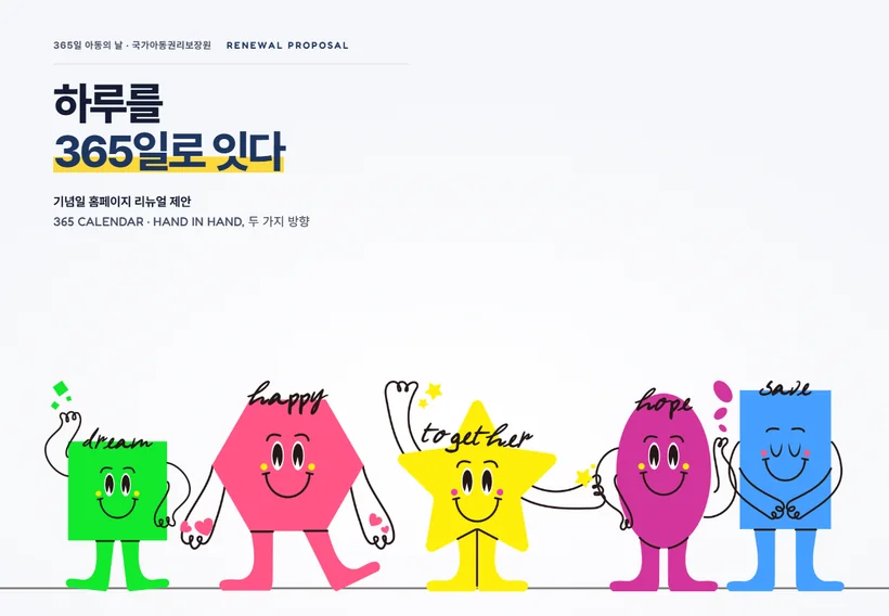
A renewal proposal for a commemorative-day website. It starts from the way the characters of five commemorative days are drawn with dots (eyes and cheeks), lines (ink-black arms and handwriting) and planes (colored shapes). Five color pairs and a text color are measured from the campaign art, 35 day-specific menus are regrouped into five days × five paths, and two proposals follow: 365 CALENDAR, which marks every day of the year as a dot, and HAND IN HAND, which links the five days with a single line.