Request a project consultation Skip to project introduction

NRCNRC · HOMEPAGE RENEWAL · 2026

Where twosemicircles meet

The NRC website is where research from twenty-six national research institutes reaches policy and the public. This is a record of the three times we redrew it.
6 operations improvement screens · Council introduction film · 2 renewal designs

Read case

01 · TWO HALVESThe Council’s symbol is two semicircles
The upper left stands for the economy, the lower right for humanities and society

02 · 26 INSTITUTESAround it are twenty-six national research institutes
We grouped them into five fields, from economy and industry to administration, law and unification

03 · 4,581 RESULTSThe institutes’ research has built up into 4,581 results
Reports, briefs, videos and card news are gathered in one place

01 / OVERVIEWProject Overview

Where research
becomes policy

The National Research Council for Economics, Humanities and Social Sciences (NRC) is a public institution under the Prime Minister. From the Korea Development Institute to the Korea Institute of Child Care and Education, it supports and evaluates twenty-six government-funded research institutes in the fields of economics, humanities and social sciences, organizes cooperative research among them and shares the results. The website is the first gateway through which those results reach policymakers and the public. The Korean and English websites, the webzine “Future Policy FOCUS” published twice a year, and a newsletter that about 3,000 people receive every week all go out through it.

We redrew this website three times. In mid-October we made six screens that solve operational problems within the current framework; at the end of October, a scrolling film introducing the Council; and in November, two main page designs made as if renewing the site from scratch. This page lays out, in order, the symbol and colors we read along the way, the numbers we counted ourselves, and the screens we chose and discarded.

CLIENT
National Research Council for Economics, Humanities and Social Sciences (NRC)
Public institution under the Prime Minister
SITE
nrc.re.kr
Korean · English · Future Policy FOCUS
OUR ROLE
Site assessment, information architecture,
UI and motion design, screen designs
DELIVERABLE
6 operations improvement screens · 1 introduction film,
2 renewal main page designs
  • 26Affiliated research institutesFrom economy and industry to administration, law and unification
  • 4,581Research results boardCounted ourselves on November 1, 2026
  • 3,000peopleWeekly newsletter recipientsSent to approximately 3,000 people each week
  • 2issuesWebzine published per yearFuture Policy FOCUS · 20 to 30 articles per issue
  1. Measuring the current site

    We opened the first screens of the Korean site, the English site and the webzine three times each and recorded display times and transfer sizes.

  2. Round 16 operations improvement screens

    We turned the first screen hidden by pop-ups, webzine articles, banner management, the satisfaction survey and newsletter recipient management into screen designs.

  3. Round 2Council introduction film

    We built a scrolling landing page that draws the symbol’s two semicircles and the twenty-six institutes in particles.

  4. Counting 4,581 results

    We counted the research results board by type and topic and rebuilt the information structure.

  5. Round 3Two renewal designs

    We made TWO HALVES, which starts from the form of the symbol, and QUESTION FIRST, which starts from users’ questions.

02 / SYMBOLTwo semicircles

The upper half of the Taegeuk:
two semicircles

The Council’s symbol is made of one gray dome and two semicircles. Measuring the proportions on the official signature image, we found that the dome is a half-ellipse 4 wide and 1.6 high, and that each semicircle’s diameter is exactly half the dome’s width. Only by understanding these simple proportions can the shapes be moved, stretched and split while still reading as the Council’s symbol.

4 1.6 2 Economic and Social Research Council1999 Humanities and Social Research Council1999 NRC2005.7
  1. 01Baseline

    Every shape starts from a single horizontal line. The gray dome and the Coral semicircle sit above it, the Seagreen semicircle below it.

  2. 02Gray dome · 4 : 1.6

    Measured on the official signature, the dome’s width and height are 4 to 1.6. Lower than a semicircle of the same width, it gives the impression of embracing broadly rather than soaring upward.

  3. 03Coral semicircle · economy

    This is the semicircle on the left inside the dome. Its diameter is 2, exactly half the width of the dome. The Council explains that this semicircle stands for an economy that pursues happiness and prosperity.

  4. 04Seagreen semicircle · humanities and society

    The semicircle on the right drops below the baseline. It stands for humanism and a welfare society. It is the only shape that extends outside the dome.

  5. 05S-curve · Taegeuk

    Join the curves of the two semicircles and you get the Taegeuk’s S-curve. Complete the circle with a dotted line, and the symbol turns out to be the upper half of a Taegeuk, slightly flattened. The Council calls this its ideal of convergence.

  6. 061999 · Two councils

    The Council did not start out as one. In March 1999, the Economic and Social Research Council and the Humanities and Social Research Council were founded separately.

  7. 072005 · One council

    In July 2005, the two councils merged to form the NRC. The symbol’s two semicircles mirror the Council’s history as well. We made this parallel the starting point for all of our designs.

NRC’s symbol mark is based on the image of the Taegeuk, a symbol of the universe and of the Republic of Korea. The semicircle on the left stands for an economy that pursues happiness and prosperity, and the semicircle at the lower right stands for humanism and a welfare society; together they symbolize the Council’s ideal of convergence.

NRC Public Relations Center · CI introduction
03 / COLORcolor

On white, these colors
cannot be text

The Council has three official colors: Coral, Seagreen and Gray. All three are soft, low-saturation colors that sit calmly together within the symbol, but as text on white their contrast reaches only 1.9:1, 2.3:1 and 3.4:1. All three fall short of 4.5:1, the standard for body text on public websites. On dark backgrounds, by contrast, they reach a comfortable 11.0:1, 8.9:1 and 6.1:1.

So we split the colors into two layers. The official colors are used as they are for large areas, big shapes and text on dark backgrounds; for text and thin lines on white, we made separate steps that keep the same hue and only lower the lightness.

  • NRC CoralNRC Coral
    HEX
    #DCB496
    PANTONE
    727UP
    CMYK
    C8 M25 Y40 K0
    RGB
    R220 G180 B150
    Upper-left semicircle · economy
  • NRC SeagreenNRC Seagreen
    HEX
    #88B29F
    PANTONE
    557UP
    CMYK
    C41 M5 Y33 K1
    RGB
    R136 G178 B159
    Lower-right semicircle · humanities and society
  • NRC GrayNRC Gray
    HEX
    #8C8A88
    PANTONE
    2332UP
    CMYK
    C2 M0 Y0 K57
    RGB
    R140 G138 B136
    Dome
  • Main logotypeMain Logotype
    HEX
    #212121
    CMYK
    C0 M0 Y0 K90
    RGB
    R33 G33 B33
    Korean and English names
  • Secondary logotypeSub Logotype
    HEX
    #555555
    CMYK
    C0 M0 Y0 K80
    RGB
    R85 G85 B85
    supplementary letters
Official colorsWhite background #FFFFFFInk background #212121Black background #000000
NRC Coral Abc Aa1.9:1Not for text Abc Aa8.4:1OK for body text Abc Aa11.0:1OK for body text
NRC Seagreen Abc Aa2.3:1Not for text Abc Aa6.8:1OK for body text Abc Aa8.9:1OK for body text
NRC Gray Abc Aa3.4:1Large text only Abc Aa4.6:1OK for body text Abc Aa6.1:1OK for body text
TEXT-SAFE STEPS

Same hue, different lightness

400 is the official color. On white, 500 is the first step that passes the threshold for large text (3:1), 600 for body text (4.5:1) and 700 for small text (7:1). Click a color to see it as real text on the right.

Coral
Seagreen
gray
white background4,581 research results

We look for research that leads to policy practice.

4.5:1OK for body text
Ink background4,581 research results

We look for research that leads to policy practice.

3.5:1Large text only

Color chosen #917058 Coral 600

Collaborative research report

October 22, 2026 · Council

Official colors as textHard to read on white at 1.9:1 and 2.3:1.
Collaborative research report

October 22, 2026 · Council

Official colors for large areas, step 600 for textPasses 4.5:1 and still reads as the same color.
Collaborative research report

October 22, 2026 · Council

Blue #3447CA from the Round 1 designsEasy to read, but the Council’s colors survive only in the logo.
04 / CHECKCurrent site

We started with
what covers the first screen

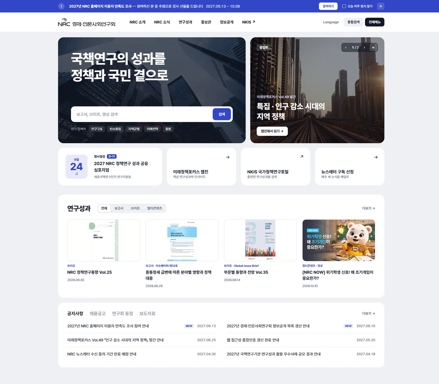
In October 2026, two pop-ups announcing a user satisfaction survey covered the first screen of the Korean website. On phones, the pop-ups hid almost the entire screen. Notices still have to reach people, but the first screen must stay clear, so our Round 1 designs began by moving the pop-ups into a strip banner at the top and a pop-up zone within the page.

  1. 01Two pop-ups cover the title and search box on the first screen.
  2. 02Time-limited notices fold into a strip banner at the top. Clicking “Don’t show again today” hides the strip banner too.
  3. 03Promotions such as a new webzine issue rotate one by one in the pop-up zone within the page. It has a pause button.
BASELINE · 2026.10.13

On October 13 we measured the public pages ourselves

The main content of the first screen appears in just over a second. But it takes more than 4 seconds until the whole Korean main page has loaded, and the transfer size reaches about 64MB. That weight could be cut by starting the main video as a still image and loading off-screen images later.

ScreenMain content shown · Full load (seconds)RequestsTransfer size
Korean main pagePC 4.2 seconds1.3 seconds 169 requests About 64 MB
Korean main pageMobile 4.1 seconds1.0 seconds 160 requests About 64 MB
Future Policy FOCUSPC 2.0 seconds2.0 seconds 66 requests About 14 MB
English main pagePC 0.7 seconds0.5 seconds 62 requests About 13 MB

Medians of three loads per page in Chromium on our office connection. PC is a 1,440px screen and mobile a 390px screen; values vary with the pop-ups and videos showing at the time of measurement.

05 / DATA4,581 results

We counted all
4,581 research results

The research results board brings together reports, briefs, multi-content and data from the Council and the twenty-six institutes. On November 1, 2026, we counted the posts by type and topic on its list pages. Each dot below is one post.

Of the four types, multi-content is the largest, with 1,960 items. Of those, 1,366 are videos, so the board was already shifting from “a place to post long reports” to “a place to glance at and move on.”

  1. Reports1,274 items · 27.8%Collaborative research reports 981 · Other research reports 293
  2. Briefs649 items · 14.2%Research Institute Brief 265 · Global Issue Brief 112 · NRC Policy Brief 112 · Policy Research Platform Brief 82 · Research Trend 39 · NRC Policy Research Trend 26 · NRC Data Brief 13
  3. Multi-content1,960 items · 42.8%Videos 1,366 · Posts 465 · Card news 112 · Data in pictures 12 · Webtoons 5
  4. Data698 items · 15.2%Event proceedings 469 · Evaluation data 122 · Other data 107

Source: research results board listings on the NRC website (November 1, 2026). Types follow the board’s own categories. Topics were counted by filtering each of the 16 categories separately, so the 180 items that fall under none of them are shown separately. Reading times are rough groupings by format.

06 / ROUND 1Round 1 · Operations improvement screens

Within the current framework,
solving operational problems

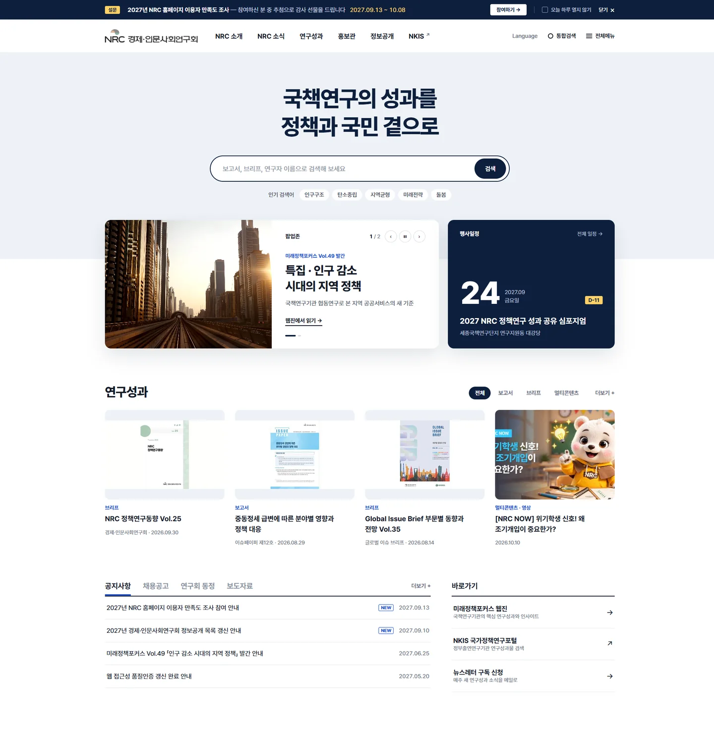
The first proposal was not to tear the site down. We kept the menus and page layouts as they were and tackled the tasks staff face every week across six screens. We drew the Korean main page four times in one evening and presented the last two as Design A and Design B.

  1. 1Dark visual and pop-up zone

    The first main page placed the search box over a dark visual with a floating illustration of balance scales, and attached the pop-up zone on the right.

  2. 2Myeongjo title and cream background

    The second main page switched the title to a Myeongjo serif and the background to cream, and split research results into one large cover and a list.

  3. BSearch in the center

    Design B centered the title and search box on the screen and put the pop-up zone and event schedule in a row below.

  4. ASearch inside a large visual

    Design A set a large visual holding the search box side by side with the pop-up zone, and lined up the event schedule and three shortcuts in a row below.

MAIN · A / B

Where should search go?

The two designs differ in where the search box sits: inside the visual in Design A, in the center of the screen in Design B. As you scroll, each page glides from top to bottom in turn: Design A, Design B, then both side by side. You can also pick one with the buttons.

Round 1 Korean main page, Design A: a large visual holding the search box beside the pop-up zone, the event schedule and shortcuts, research results and notices
Round 1 Korean main page, Design B: a centered title and search box, the pop-up zone and event schedule, research result cards, notices and shortcuts
SIX SCREENS

We drew six screens that follow a year in the life of the site’s operations staff. Select a screen to view it larger.

  1. 01Korean main page · strip banner zone and pop-up zone

    So that pop-up windows no longer cover the first screen, we moved notices such as the satisfaction survey to a strip banner at the top and promotions such as new webzine issues to a pop-up zone within the page.

  2. 02Admin · Banner management

    Staff register strip banners and pop-up zone banners themselves and schedule when they start and end. If the alt text is missing or the contrast is below 4.5:1, a warning appears before the banner is registered.

  3. 03Future Policy FOCUS · Article

    The article page that goes online within two weeks of the print edition. The table of contents, other articles in the issue and a subscription signup sit beside the article.

  4. 04Responsive · 390px

    The same article and main page fit a phone screen without overflowing. Wide tables scroll sideways with a swipe.

  5. 05User satisfaction survey · Mobile

    A 12-question survey aiming for about 1,500 participants. People can take part without consenting to the use of personal information; consent is requested only for the gift draw.

  6. 06Admin · Newsletter recipients

    Manages consent expiry for the newsletter that goes to about 3,000 people every week. A consent renewal notice goes out automatically 30 days before expiry, and email addresses show only their first two characters.

Titles, dates and figures shown on the screens are samples used to explain the structure.

07 / ROUND 2Round 2 · Council introduction film
Round 2 · October 26

THE HUB OF NATIONAL POLICY RESEARCHA scroll film introducing the Council

The second proposal started less from problems on the screen than from the impression the Council makes on someone meeting it for the first time. As you scroll, particles shift from the NRC letters into the symbol, into orbits of the twenty-six institutes, and into a wave of core values.

  • Each particle travels between the letters, the symbol, the orbits and the wave
  • Choose a field and only that field’s institute clusters brighten
  • The timeline from 1999 to 2024 scrolls sideways
  • On devices set to reduce motion, the same content appears without animation
Ink · Coral · Seagreen · Ivory
  1. From the NRC letters to the symbol

    As you scroll, the particles that formed the NRC letters on the first screen move into the gray dome and the two semicircles.

  2. Orbits of the twenty-six institutes

    Press a field button and only the particle clusters of that field’s institutes brighten, while their name tags circle along the orbit.

  3. A wave of core values

    As the words reliability, creativity and expertise change in turn, the particles flow as a wave along the bottom.

  4. A horizontal timeline

    Scrolling down moves a horizontal timeline from the two councils of 1999 to the 25th anniversary in 2024.

08 / STRUCTUREstructure

From the order of institutions
to the order of questions

The current menu is ordered to explain the Council as an institution: About NRC, NRC News, Research results, Public Relations Center, Information disclosure. Yet most visitors arrive through search rather than the menu, carrying a question rather than an institution’s name. Renewal Design B keeps the six familiar menus and opens five paths into research results within the main page. Hover over a menu on the left to see the paths it leads to.

Current · 6 menus
  1. About NRCChairperson · Key bodies · Purpose and history · Organization and departments · Directions
  2. NRC NewsNotices · Press releases · NRC Activities · Newsletter · Careers · Event schedule
  3. Research resultsResearch reports · Research briefs · Multi-content · Research data · Future Policy FOCUS
  4. Public Relations CenterCI introduction · Promotional materials · 25th anniversary projects
  5. Information disclosureInformation disclosure system · Advance information disclosure · Open public data · Business real-name system
  6. NKISNational Policy Research Portal (external)
Renewal Design B · 5 paths from the main page
  1. By questionSearch box on the first screen · Six groups of this week’s questions
  2. By topicSix question groups · Find by format
  3. By reading time3 minutes, 10 minutes, more than an hour
  4. By research institute26 institutes · a map of five fields
  5. Webzine · Events · NewsletterFuture Policy FOCUS · November events · Weekly newsletter
09 / DIRECTIONSTwo directions

Starting over,
in two directions

For the third proposal, in November, we set the current site’s framework aside and approached it as a renewal from scratch. Both designs use the same facts and the same research results, but one starts from the form of the symbol and the other from users’ questions.

TWO HALVES

Two semicircles

“Two semicircles meet and become one policy.”

background
The three official colors fill large areas on white #FFFFFF.
Visual language
Semicircles, the dome and the S-curve. Card tops, button ends and even date badges all come from the same shapes.
Opening screen
Baseline → dome → two semicircles → color areas where the three shapes divide the screen
movement
Elements enter along arcs with a distant center of rotation and are revealed through a dome-shaped mask.
font
Pretendard · Manrope
View Design A recording

QUESTION FIRST

From question to policy

“Twenty-six research institutes answer one question.”

background
Dark green #0F1C19 alternates with white.
Visual language
27 dots for the institutes and lines shaped like the S-curve.
Opening screen
Question → publishing institute’s dot → lines → real research result card
Ways in
Question groups · Topics · Reading time · Research institutes
font
Pretendard · Inter Tight
View Design B recording
10 / SIAN ARound 3 · Renewal design A
Round 3 · Renewal design A

TWO HALVESTwo semicircles meet and become one policy

A design that makes the symbol’s three shapes the formal grammar of the whole site. A dome rises from a single baseline, the Coral semicircle rolls in, the Seagreen semicircle settles below the baseline, and then the three shapes become color areas that divide the screen.

  • On the first screen, the symbol assembles and then becomes color areas, with site search set between them
  • Four half-donut gauges show the type breakdown of the 4,581 results
  • The twenty-six institutes sit as small semicircles along the arc of a large dome
  • Official colors only for large areas; text on white uses steps 600 and 700
White · Ink · Coral · Seagreen · Gray
  1. The first screen where three shapes become a color area

    The dome rises above the baseline and the two semicircles settle into place; then the symbol grows larger than the screen and the three shapes become color areas framing the title and site search.

  2. A timeline turned by a semicircle dial

    The two semicircles, apart in 1999, interlock into an S-curve in July 2005, and a dot travels along the arc to the 2024 Innovation Strategy.

  3. Half gauges shaped like the dome

    Four semicircle gauges show the type breakdown of the 4,581 research results, and the cards sit in frames with a semicircle cut out of the top edge.

  4. Twenty-six semicircles along the dome

    Each institute gets a small semicircle lined up along the arc of the large dome; choose a field and those institutes’ semicircles rise outward.

11 / SIAN BRound 3 · Renewal design B
Round 3 · Renewal design B

QUESTION FIRSTTwenty-six research institutes answer one question

A design that starts from the questions visitors bring with them. As a question types itself into the search box letter by letter, the dot of the institute that published the research lights up, and lines echoing the symbol’s S-curve gather to open a real research result card.

  • As four questions cycle through, every card that opens as an answer is a real research result
  • The topic scheme, with half of all items under “General,” is regrouped into six question groups
  • Visitors choose content by reading time: 3 minutes, 10 minutes or 1 hour
  • The twenty-six institutes appear on a map of five fields
Dark green · Ivory · Coral · Seagreen
  1. As a question types out, lines gather

    As “Why do young people stay ‘just resting’?” types out, the dot for the Korea Research Institute for Vocational Education and Training lights up, and lines gather below the search box to open a real issue brief card.

  2. Turning “General” into question groups

    The “General” block that covered half the chart splits into six pieces that slot under the question groups, and the remaining topics are redistributed group by group.

  3. 3 minutes, 10 minutes, 1 hour

    Pick content by reading time and a dome-shaped dial fills to that share, with real items listed below.

  4. A map of institutes in five fields

    S-curves link the central symbol to the twenty-six institutes; choose a field and only that field’s lines are redrawn in Coral.

12 / YEAR1 year of operation

The twelve months
after launch

A website spends far longer in operation than it does on launch day. The proposal also laid out the 2027 operations schedule as a calendar. The web accessibility certification mark is renewed before it expires on May 27, the webzine goes online within two weeks of the print edition, and the newsletter goes out every week. The dome below unfolds the symbol’s gray dome into a calendar of the year.

JanuaryHandover and stabilization

  1. JanuaryHandover and stabilization · Commencement report (within 14 days of contract) · Web accessibility self-assessment
  2. FebruaryAccessibility fixes based on the assessment
  3. MarchApplication for web accessibility certification review (first week)
  4. AprilRevisions based on review feedback
  5. MayCertification mark renewal (before expiration on May 27)
  6. JuneWeb release of the first-half webzine (within 2 weeks of the print edition)
  7. JulyInterim report (6 months after commencement)
  8. AugustSatisfaction survey questions and PR preparation
  9. SeptemberUser satisfaction survey (target of around 1,500 people)
  10. OctoberSatisfaction survey results report
  11. NovemberWeb vulnerability check · Web release of the second-half webzine
  12. DecemberCompletion report · Source submission · Improvement priority report for next year
  • WeeklySupport for sending newsletters (approximately 3,000 people)
  • DailyCheck site status before working hours
  • MonthlyServer/DB inspection and backup confirmation, monthly report (second week)
  • OngoingBanner design within 1 business day of a request; outage response begins within 2 hours
13 / RETROSPECTLooking back

What three proposals
left us

We proposed several directions, but none led to a final selection. Even so, the three proposals tackled the same question at different depths. The first eased the burden of operations while keeping the current screens, the second sketched the impression the Council makes on someone meeting it for the first time, and the third rebuilt the site from two starting points: the symbol and questions.

  1. Round 1Maintaining the current framework

    Four Korean main page versions and six operations screens

  2. Round 2Sketching a first impression

    Particle-drawn Council introduction film

  3. Round 3Rebuilding from scratch

    TWO HALVES · QUESTION FIRST

  • 01For color, we calculate contrast first

    Because we first showed in numbers that the official colors fail as text on white, both renewal designs could split color into large areas and text from the very start.

  • 02We count the numbers ourselves

    Had we not counted all 4,581 results by type and topic, we would never have known that “General” holds half of them, or that there are more videos than reports.

  • 03We design the year after launch, too

    We designed date-bound work, such as certification renewal, webzine publishing and the weekly newsletter, alongside the screens.

14 / CREDITSNRC · BLUECANVAS WORKS

NRC HOMEPAGE RENEWAL

Where two semicircles
meet

NRC · 6 operations screens · Introduction film · 2 renewal designs

ItemDetail
ClientNational Research Council for Economics, Humanities and Social Sciences (NRC) · Public institution under the Prime Minister
ScopeKorean main page · Future Policy FOCUS · Admin screens · Council introduction · Renewal main page
PeriodOctober–November 2026
Round 16 operations improvement screens (four Korean main page versions · banner management · webzine article · responsive layout · satisfaction survey · newsletter recipient management)
Round 2Council introduction scroll film · Five particle forms · 11 scenes
Round 3TWO HALVES · QUESTION FIRST renewal main page designs
IdentityTwo semicircles · NRC Coral #DCB496 · Seagreen #88B29F · Gray #8C8A88
Data4,581 research results · 1,764 event schedule entries (as of November 1, 2026)
TypefacePretendard · Outfit
StudioBlueCanvas

GoalResearch from 26 institutions reaches people with questions

WHERE TWO HALVES MEET

Let’s design the path
from research to policy together

Starting from your symbol and numbers we count ourselves,
we will design launch-day screens and a year of operation together.

    Contact

    A rough idea is a good place to start.
    Let’s shape your project together

    Tell us where you are and what you want to achieve. We’ll outline a practical scope, process, and estimated budget.

    4 questions · about 2 minutes

    Scope

    What would you like to work on together?

    Select as many as apply. If you are not sure yet, choose “Other”.

    Budget

    What budget range do you have in mind?

    Even a rough range helps us shape the proposal.

    Project details

    Tell us where you are right now.

    It does not need to be polished. Tap an item below and the outline is filled in for you.

    0

    Upload up to 2 RFPs or reference files. Supported: PDF, PPT, Word, Excel, JPG, PNG, ZIP

    Contact

    Where should we reply?

    Scope, budget, project details and contact information are required.