Request a project consultation Skip to project introduction
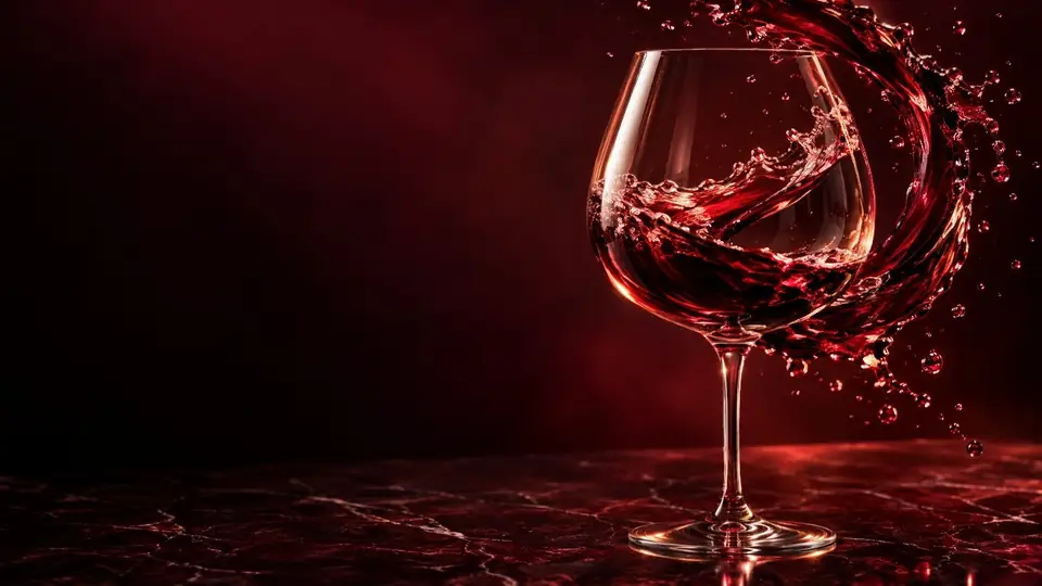
Red wine glass tilted with fingertips on white paper. The center is a deep ruby, and the upper edge where the wine thins out is purple.

EASYWINE · CASE STUDYThe EASYWINE homepage renewal proposal started with tipping a wine glass on a white piece of paper.

TILT TESTWhen you tilt the glass, the center appears ruby, and the edge where the wine becomes thinner appears purple

20 SAMPLESFrom the center to the edge
20 points of color were selected.

TWO DIRECTIONSThe two designs chose their own colors from both ends of this band.

EASYWINEWEBSITE RENEWAL PROPOSAL

ruby in the center,violet on the edges.

EASYWINE homepage renewal proposal
Ruby in Motion · Easy Pour, two directions

BLUECANVASA · BPRODUCT OF SEOUL

Read case
01 / OVERVIEWProject Overview

An importer who helps you choose the world's wine
easily

EASYWINE is a wine importer launched in 2012. We introduce 25 types of wine selected from seven brands from Chile, the United States, France, Italy, and Spain to Korea, and we also prepare gift sets tailored to holidays and anniversaries. The management policy stated in the company introduction is “to provide high-quality wine at a reasonable price.”

The current website consists of data posted in 2015 and 2016. BlueCanvas re-read this material and redesigned the main page so that even first-time wine buyers can easily find the company's story, brand, and wines. And we proposed two directions: Ruby in Motion and Easy Pour.

CLIENT
EASYWINE Co., Ltd.
Wine importer launched in 2012
SECTOR
Wine import and distribution
Gift set
OUR ROLE
Research, brand interpretation, information structure,
UI design, motion graphics, scroll film
DELIVERABLE
2 types of main design proposals, mobile screen,
scroll film, color and font guide
  • 2012LaunchThe year we started importing and introducing wines from around the world
  • 5countriesWine producing regionsChile, United States, France, Italy, Spain
  • 7wine brandsFrom Valdivieso to Pink Elephant
  • 25Introducing wines16 types of red, 6 types of white, 3 types of sparkling and rosé
02 / CHALLENGEStarting point

The website’s home screen is now configured.
  1. 1There are six menus: company, brand, gift set, wine, sidewalk, and gallery.
  2. 2On the first screen, photos of twelve bottles of wine are laid out like a checkerboard. Click on the bottle to go to the product description.
  3. 3The company introduction and the seven brands are each illustrated with text.

TEXT IN A PICTURE

The letters in the picture become blurry when enlarged.

The first line of the company introduction was placed side by side, with text written in a 650px wide picture and text written in web text as before. Drag the bar to the right to zoom in.

Now · Text in the pictureSearch ✕ · Translate ✕ · Screen reading ✕
Experience is not ‘quantity’, but ‘quality’
Suggestion · Web textSearch ○ · Translation ○ · Screen reading ○

FOUR QUESTIONS

Renewal started with
Four Questions

The current website is structured to quickly display wine photos. First-time visitors need to read the letters in the picture to know what criteria to choose and what kind of company the company is.

  1. Q1
    Can people who don't know much about wine make a choice on the first screen?

    Right now I only see a picture of the bottle and the name. The two designs allowed people to find wine by simple criteria such as red, white, and sparkling, as well as food and provenance.

  2. Q2
    Can you tell the story of the company trapped in the picture in writing?

    We rewrote both the company and brand introductions in writing so they could be searched, translated, and read clearly on mobile phones.

  3. Q3
    Can you show us seven brands and five countries at a glance?

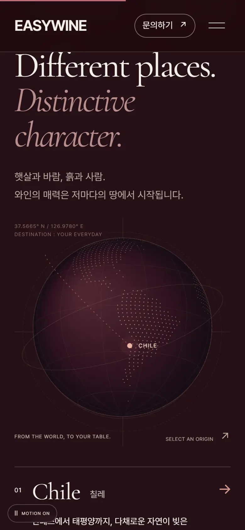
    In both designs, the production area is indicated on a globe, and when you select a country, the brand and story of that country appear.

  4. Q4
    Where should someone looking for a gift or delivery go?

    Proposal B provided separate guidance on gift sets, business delivery, and event sponsorship, while Proposal A provided gift consultation directly through the inquiry window.

03 / BRANDReread the logo

Wine company whose logo isviolet

Before creating the new symbol, I re-read the sentences written in the current name, logo, and company introduction. A wine company's logo would likely be red, but EASYWINE's logo was purple from the beginning. I tried to follow where the purple came from.

01 · EASY + WINE

The name is a promise

The name EASY WINE carries the promise of making wine easy. The company introduction also states the management policy of “providing high-quality wine at a reasonable price.” Both design proposals started by translating this promise into a sentence on the first screen.

02 · THREE VIOLETS

three behold of logo

Behind the E in the logo are three overlapping translucent shapes. The colors are lavender, orchid, and purple. The first question about this renewal was that it is a wine company's logo and does not have any red in it.

03 · RIM

The purple found at the edge of the glass

If you tilt a young red wine on white paper, the wine will turn purple from its thinner edges. As the years go by, the light changes from ruby ​​to pomegranate to brick red. We read the purple of the EASYWINE logo as the color of this edge.

04 · QUALITY

‘Quality’ not ‘quantity’

The company introduction written in 2015 begins with the sentence, “Experience is ‘quality,’ not ‘quantity.’” In the manuscript, ‘quantity’ was colored gold and ‘quality’ was colored red. I thought that a website that shows a good selection rather than listing a lot fits this sentence.

05 · TWO OPENINGS

The first sentence of both designs

Proposal A, Ruby in Motion, opens with 「A little wine, a lot of life.」, and Proposal B, Easy Pour, opens with 「Easy to Understand·Approach·Drink.」 One side of the design starts from the center of the glass, and the other side starts from the edge of the glass.

04 / WORDSunfamiliar words on labels

Unfamiliar words on labels
in table words

What makes wine difficult is the name rather than the taste. The names of EASYWINE's 25 wines contain many words copied directly from the labels, such as Single Vineyard and Riserva. In preparation for renewal, I tried to translate these words into one sentence in Korean. This is a small dictionary that can be attached to the product details screen.

  1. Single Vineyard

    single vineyard

    Only grapes from one vineyard

    This means that it is made only from grapes grown in one vineyard, rather than mixing grapes from multiple fields. The soil and sunlight of the field remain in the taste.

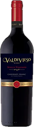
    Bottle of Valdivieso Single Vineyard Cabernet Franc
    Valdivieso Single Vineyard Cabernet Franc
  2. Riserva

    Riserva

    Aged longer than the basic wine

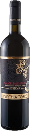
    This means it has been aged longer than the base wine of the same name. In Italy, each production region sets a minimum ripening period that Riserva must adhere to.

    Vecchiatore Salis Salentino Riserva Bottle
    Vecchiatore Salis Salentino Riserva
  3. Solera

    solera

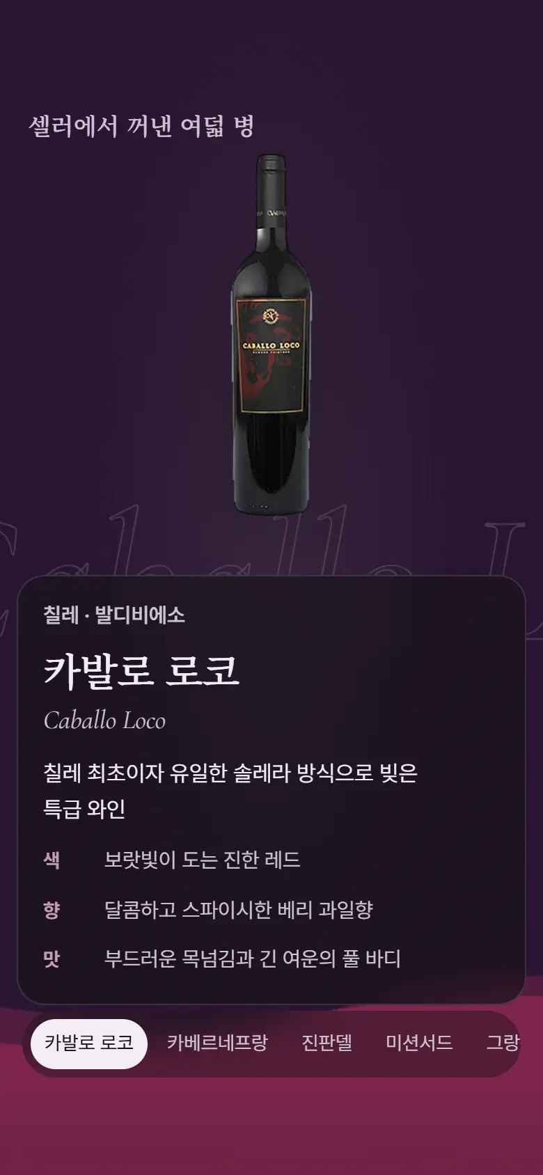
    Adding new wine to the previously made wine

    This is an aging method in which newly made wine is added little by little to previously made wine, and the flavors of many years are preserved in one bottle.

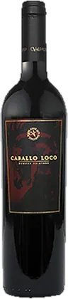
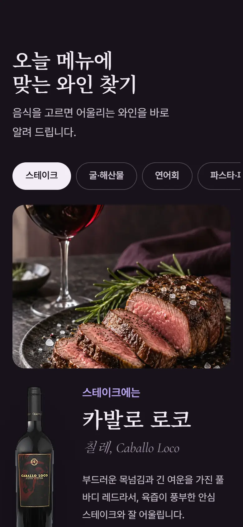
    Cavallo Loco Bottle
    Cavallo Rocco
  4. Crémant · Brut

    Crémant · Brut

    A non-sweet sparkling drink made like champagne

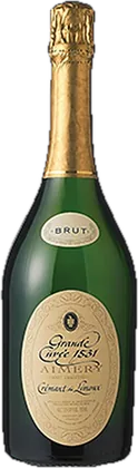
    Crémant is a sparkling wine produced in France outside of Champagne and fermented again in the bottle in the same way as Champagne. Brut means not sweet.

    Grand Cuvée 1531 bottles
    Grand Cuvée 1531
  5. Old Vine
    old vine

    Picked from old vines

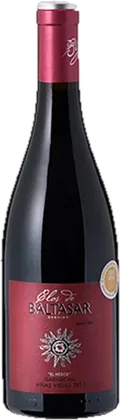
    This refers to vines that have grown for more than several decades. Although the fruit is small, each grain has a richer taste.
    Baltasar Garnacha Hero Bottle
    Baltasar Garnacha Hero
  6. Moscato

    moscato

    Green grapes with a bright scent

    This is a green grape variety with bright floral and fruity aromas. It is often used to make sweet and light sparkling wine.

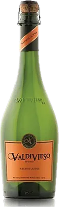
    Bottle of Valdivieso Sparkling Moscato
    Valdivieso Sparkling Moscato
  7. Zinfandel

    Zinfandel

    Red grapes representing California

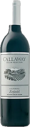
    It is a representative red grape variety of California. It is the same grape variety called Primitivo in southern Italy.

    Callaway Zinfandel Bottle
    Callaway Zinfandel
05 / CELLARStandard for dividing 25 bottles

If we divide the twenty-five bottles
into four

Currently, the website divides wine by brand only. It's a quick route for those who know the brand name, but it's another unfamiliar word for first-time visitors. We reorganized the 25 types of EASYWINE based on four criteria: brand, type, production area, and food.

The “WINE” menu on the current website divides wines into seven brands. Eleven bottles are concentrated in one place in Valdivieso.

  • Cavallo RoccoCavallo Rocco
  • Valdivieso Single Vineyard Cabernet FrancValdivieso Single Vineyard Cabernet Franc
  • Valdivieso Single Vineyard MerlotValdivieso Single Vineyard Merlot
  • Valdivieso Single Vineyard Cabernet SauvignonValdivieso Single Vineyard Cabernet Sauvignon
  • Valdivieso Grand Liserva Cabernet SauvignonValdivieso Grand Liserva Cabernet Sauvignon
  • Valdivieso Grand Reserva SyrahValdivieso Grand Reserva Syrah
  • Valdivieso Grand Reserva ChardonnayValdivieso Grand Reserva Chardonnay
  • Valdivieso Cabernet SauvignonValdivieso Cabernet Sauvignon
  • Valdivieso MerlotValdivieso Merlot
  • Valdivieso ChardonnayValdivieso Chardonnay
  • Valdivieso Sparkling MoscatoValdivieso Sparkling Moscato
  • Callaway ZinfandelCallaway Zinfandel
  • Callaway Cabernet SauvignonCallaway Cabernet Sauvignon
  • Callaway MerlotCallaway Merlot
  • Callaway ChardonnayCallaway Chardonnay
  • Callaway Sauvignon BlancCallaway Sauvignon Blanc
  • Vecchiatore Salis Salentino RiservaVecchiatore Salis Salentino Riserva
  • Vecchiatore Salis Salentino RossoVecchiatore Salis Salentino Rosso
  • Vecchiatore ChardonnayVecchiatore Chardonnay
  • Mission Third Cabernet SirahMission Third Cabernet Sirah
  • Mission Third ChardonnayMission Third Chardonnay
  • Baltasar Garnacha HeroBaltasar Garnacha Hero
  • Baltasar GarnachaBaltasar Garnacha
  • Grand Cuvée 1531Grand Cuvée 1531
  • Pink Elephant Sparkling RoséPink Elephant Sparkling Rosé
06 / STRUCTUREVisitors and Scene Order

Opening the EASYWINE homepage
Five Types of People

The website of a wine importer is visited by people who are choosing wine to drink today, people who are looking for gifts, and purchasers who are looking for wine to bring to their business. Since each person was looking for different information, we first decided on a scene for each person to arrive at.

  • 01A person who chooses wine to drink today

    Choose a bottle based on the type, taste, and food that goes well with it.

    Wine · Pairing
  • 02person choosing a gift

    We are looking for 1-pack and 2-pack configurations suitable for holidays and anniversaries.

    gift set
  • 03Hotel/restaurant purchasing manager

    Check the wine and supply method that fits the business's menu and price range.

    Brand/Delivery Inquiry
  • 04Store/distribution buyer

    Check the brand's story and product information and consult about opening a store.

    Brand/wine details
  • 05Corporate gift/event manager

    Inquire about wines for gifts and events that fit your quantity and budget.

    Corporate Gifts/Inquiries

Seven short scenes,
12 long scenes

In both designs, EASYWINE is introduced in one sentence in the first scene, and then goes through the wine, production area, and gift before reaching the inquiry. Proposal A quickly conveyed the atmosphere with seven scenes, while Proposal B included separate scenes for the company's history, seller, pairing, and delivery information, making it longer and longer with twelve scenes. The color dots are each scene's job.

  • Home screen
  • Company Story
  • Choosing wine
  • Production/Brand
  • Gift
  • Delivery and cooperation
  • Moment · Report
  • Contact us

A · Ruby in Motion7 scenes

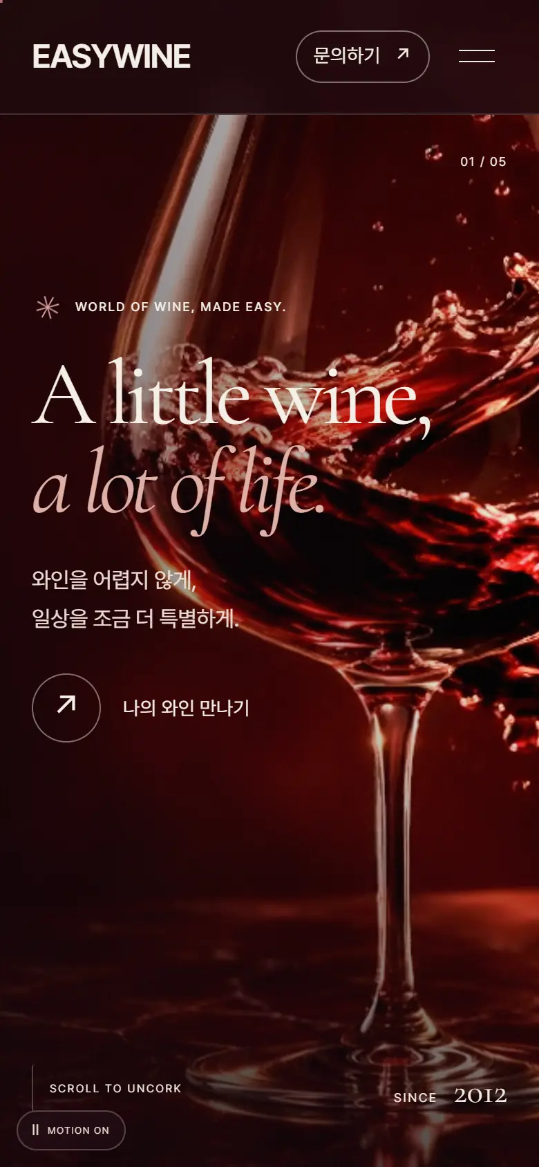
  1. 01A little wine, a lot of life.Ruby-colored video surrounding the glass and the first sentence
  2. 02Our philosophyA wider world in one glass, 2012 · 5 · 7
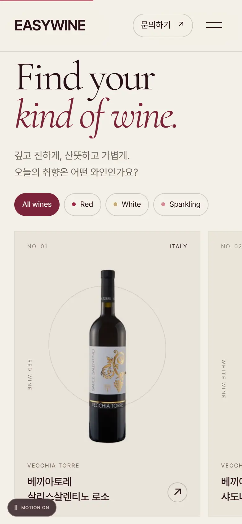
  3. 03The collectionA collection where six bottles are passed horizontally and filtered by type
  4. 04Rooted in the worldGlobal and five countries' production areas
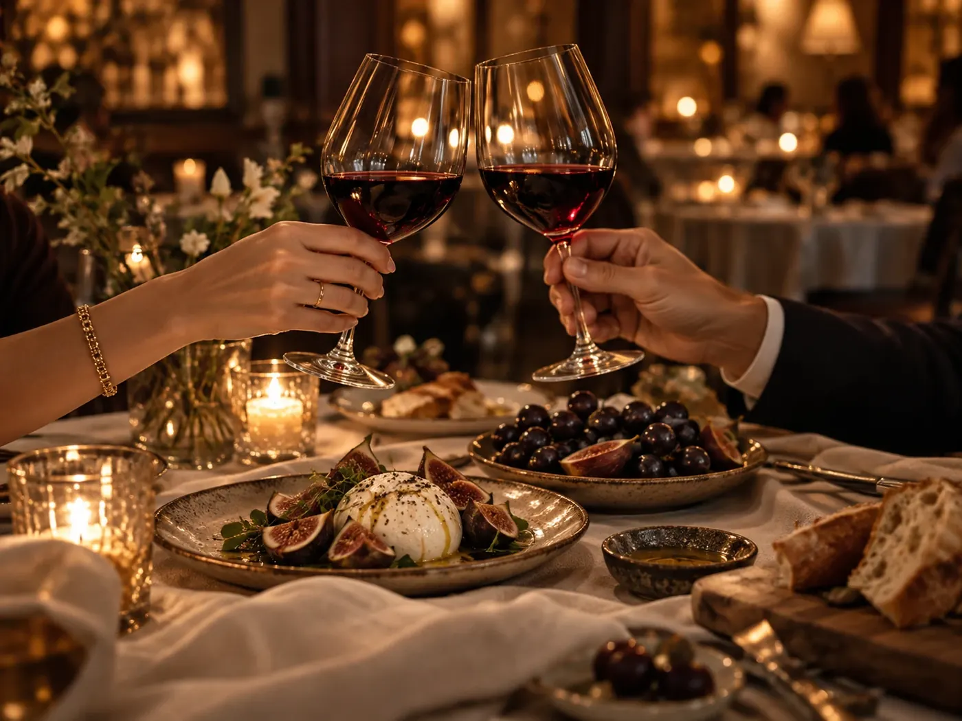
  5. 05Wine & lifeDinner table with two glasses under candlelight
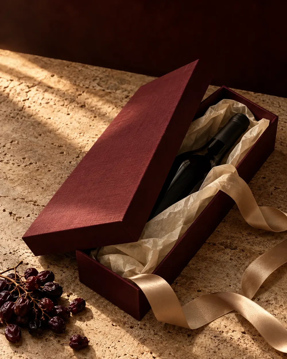
  6. 06GiftingGift box and gift consultation
  7. 07Let’s talk winePhone · Email · Map and inquiry window

B · Easy Pour12 scenes

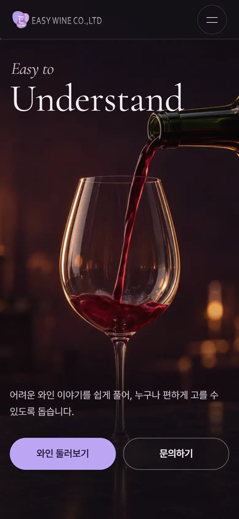
  1. 01Easy to … The home screen where wine fills the glass by scrolling
  2. 02ManifestoExperience is not ‘quantity’ but ‘quality’
  3. 03RecordHistory and numbers accumulated since 2012
  4. 04JourneyFive countries and seven brands on the globe
  5. 05BrandsLogos of seven brands
  6. 06CellarEight bottles from the cellar
  7. 07Lineup25 types of list and type filter
  8. 08PairingWine that goes well with food
  9. 09Gift1 pack · 2 packs · Golf set · Corporate gift
  10. 10PartnersHotel · Restaurant, Distribution, Event
  11. 11MomentsMoments and reports
  12. 12ContactInquiries about delivery and gifts
07 / COLORcolor chart

Between the center andrimof the glass

In the photo on the first screen, twenty dots of color were drawn at equal intervals from the center of the glass to the edge. In the deep center of the wine, it is a ruby ​​color close to black, and as it becomes thinner, it passes through a red band and becomes lighter to purple. Eye A chose the screen color from the center of this band, and Eye B chose the screen color from the edge.

EASYWINE logo symbol: Behind the letter E are three overlapping translucent shapes in lavender, orchid color, and purple.
  • Big shape after E
  • right shape
  • The shape below with EASY WINE written on it.
Look at the three things in the current logoFor Proposal B, the logo was used as is, and #BBA4F5, with a little bit of lavender, was used as the button and accent color. Proposal A places the word mark EASYWINE in place of the logo in the design, and uses ruby ​​in the center of the glass instead of purple as the brand color.

Ingredients of Ruby and
Ingredients of Purple

Proposal A reminded me of a cream-colored dining table bathed in afternoon sunlight. Top with oxblood velvet, ruby ​​wine, travertine, cherry and cork.

Proposal B reminded me of a dinner table with only one candle lit. Grape and lavender silk, amethyst glass, and purple wine-stained paper were placed on aubergine-colored linens. You can compare the two materials by dragging the center line left or right.

Materials board for Proposal A Ruby in Motion: oxblood velvet on cream paper, ruby ​​wine glasses, travertine, cherries, cork, burgundy ribbon, dried roses.
B Easy Pour material board: grapes on aubergine-colored linen, lavender silk, amethyst-colored glass, purple wine-stained paper, lavender flower stalks

A · Ruby in Motion

middle of the glass
  • Background of the dark scene · 24%Background of the first screen and the mountain scene. Instead of black, I used darkness with a reddish tinge like the inside of a bottle.

  • Lettering of a bright scene · Dark side · 17%This is the color of the text used on a cream-colored scene and the second side of a dark scene. Close to the darkest color in the center of the glass.

  • Emphasis · Less than 1%Color of italic text, filter buttons, and progress bar. Even though it makes up less than 1% of the screen, your eyes go to this color first.

  • Light · Less than 1%The same color as the light part of the wine surrounding the glass.

  • Last scene · 15%This is the basis for the inquiry scene “Shall we open a bottle?”

  • Background for bright scenes · 43%Background for stories, collections, and gift scenes. It reminded me of the color of the white tablecloth.

B · Easy Pour

edge of the glass
  • Deepest background · 12%This is the color of areas that should be darkest, such as the home screen and door scenes. It is a purple night.

  • Scene Background · 42%Most scenes fall on this color. It was revealed only one step further than Night so that the film in the first screen continued across the page.

  • Card · Side · 30%This is the background of the card, input window, and menu.

  • Wine · 13%This is the color of the wine filling the bottom and footer text of the cellar scene.

  • Emphasis · Less than 1%The color of the button and highlight text. I brightened up the lavender in the logo a bit so it could be read on a dark background.

  • Text · Less than 1%The color of the text in the body. I mixed a drop of purple with white.

Clicking on a color swatch will copy the HEX value. The number in the sample is the brightness contrast with the color of the text above it, and the ratio is a value calculated by counting the pixels closest to each color in scene captures in the two designs.

08 / TYPOGRAPHYtypeface

Two designs were chosen
same serif

The two designs were created separately, but both chose the Cormorant series for their English titles. This is a choice that transfers the texture of the classic serif commonly used on wine labels to the screen.

Proposal A enlarged the thin strokes and italics of Cormorant to make one sentence look like a poster, and all Korean letters were written in Pretendard. Proposal B used Noto Serif KR in the Korean title so that the English and Korean letters can be read with the same serif texture.

Cormorant 400 · Proposal A first screenA little wine,

A little wine,
a lot of life.

Eight bottles taken from the cellar

Noto Serif KR 600 · B-plan seller sceneKorean title
Pretendard · Proposal A Korean500 / 1.65

Wine doesn't have to be difficult,
making everyday life a little more special.

Find your kind of wine.

Noto Serif KR · Proposal B Declaration600

Experience is not ‘quantity’, but
‘quality’.

Find the right wine for today's menu

Cormorant Garamond · B wine nameItalic 400

Callaway Zinfandel

color
dark red
incense
Blackberry, black cherry, subtle chocolate
taste
Delicate tannins and exotic flavors
09 / MOTIONmotion principles

Follow, stop,
slowly passing movements

The movement in A follows the speed at which the wine slowly rotates in the glass, and the movement in B follows the speed at which the wine is poured from the bottle. In both cases, scrolling drives the movement, and when the operating system reduces the motion, it stops the video and static scenes and only shows the last screen. The four cards below actually move along the scroll.

A frame from the first screen video: Ruby-colored wine flows around a crystal glass
01 · SCROLL TO UNCORK · A

Video that stops and rewinds

The 6-second video on the first screen of Eye A plays on its own, but when you start scrolling, it stops and moves back and forth in the direction of the scroll. While passing this card, 48 frames of the video are passed in the same way.

Frame from the first screen of Proposal B: A scene where red wine is poured from a bottle into a glass.
02 · POUR · B

wine pouring scroll

The first screen of Proposal B depicts 151 frames of pouring wine from a bottle into a glass, aligned with the scroll position. As the wine rises, Understand, Approach, and Drink change sequentially. In this card, there are over 60 of them.

03 · FILL THE WORD · B

Wine filled with letters

In the final scene in B, wine flows in waves inside the letters EASY WINE. The letters on these cards are filled in the same way as they pass by.

04 · ONE BY ONE · A

A collection that goes through one bottle at a time

The collection in A changes vertical scrolling to horizontal movement to show six bottles one after another. Each card has a thin oval on the back of the bottle, and can be filtered directly using the red, white, and sparkling buttons.

Proposal A · Center of the glass

Ruby in MotionA little wine, a lot of life.

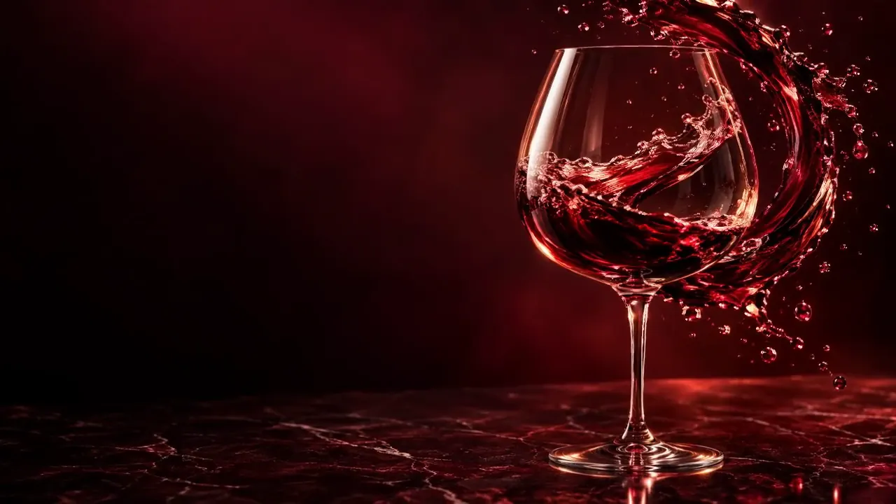
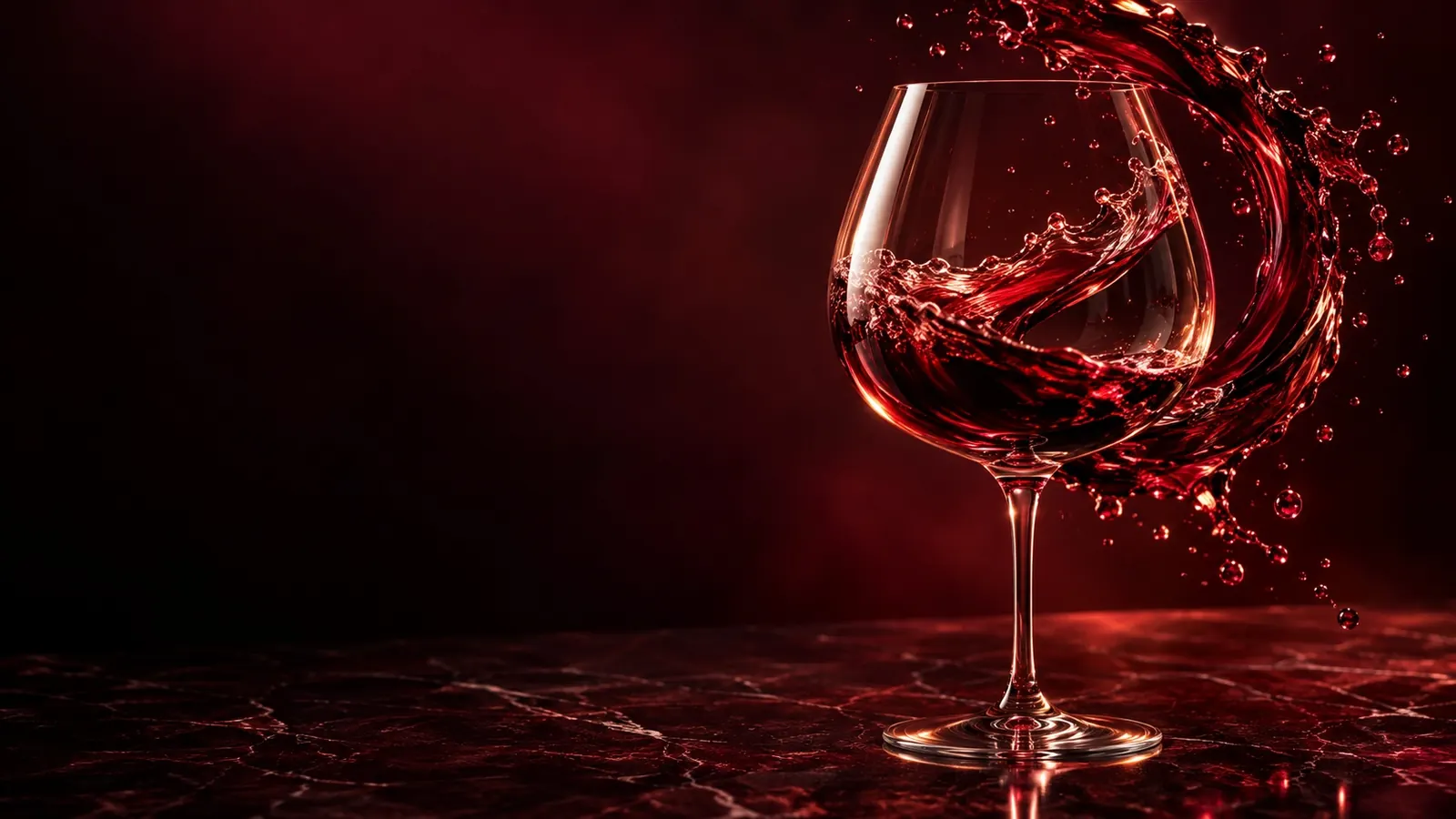
It starts with ruby-colored wine flowing around the wine glass. The 6-second video on the first screen plays on its own, but when you start scrolling, it stops and moves back and forth along the scroll. By alternating between dark ruby ​​scenes and cream scenes, I created a rhythm between the darkness in the bottle and the white tablecloth.

  • A ruby-colored image surrounding the glass and “A little wine, a lot of life.”
  • Horizontal collection and wine detail window filtering through red, white and sparkling
  • A globe that spins when you select one of five countries
  • Inquiry window that connects gift consultations and inquiries directly to the email app
Cormorant · Pretendard
DIRECTION NOTES

Among the scenes in Proposal A, I chose a moment that I put a lot of effort into directing. Click on the photo to see a larger view of each scene.

  1. A little wine, a lot of life.

    Ruby-colored wine surrounded the crystal glass, and the first sentence was written in large letters in the darkness on the left.

  2. Just one sip.

    When you scroll down, the video stops, and in its place is the first sentence, “Just one sip.” “A whole new world.” comes to the center.

  3. A wider world in one glass

    It moves to a cream-colored scene, showing 2012, 5 countries, and 7 brands in numbers.

  4. Find your kind of wine.

    A collection of six bottles of wine flipped horizontally. The country and type were written on each card.

  5. Card to pass one bottle at a time

    Vertical scrolling changes to horizontal movement, and the bar below tells you which bottle you are in.

  6. From a place. With a story.

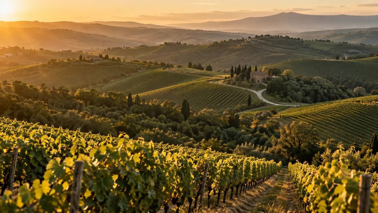
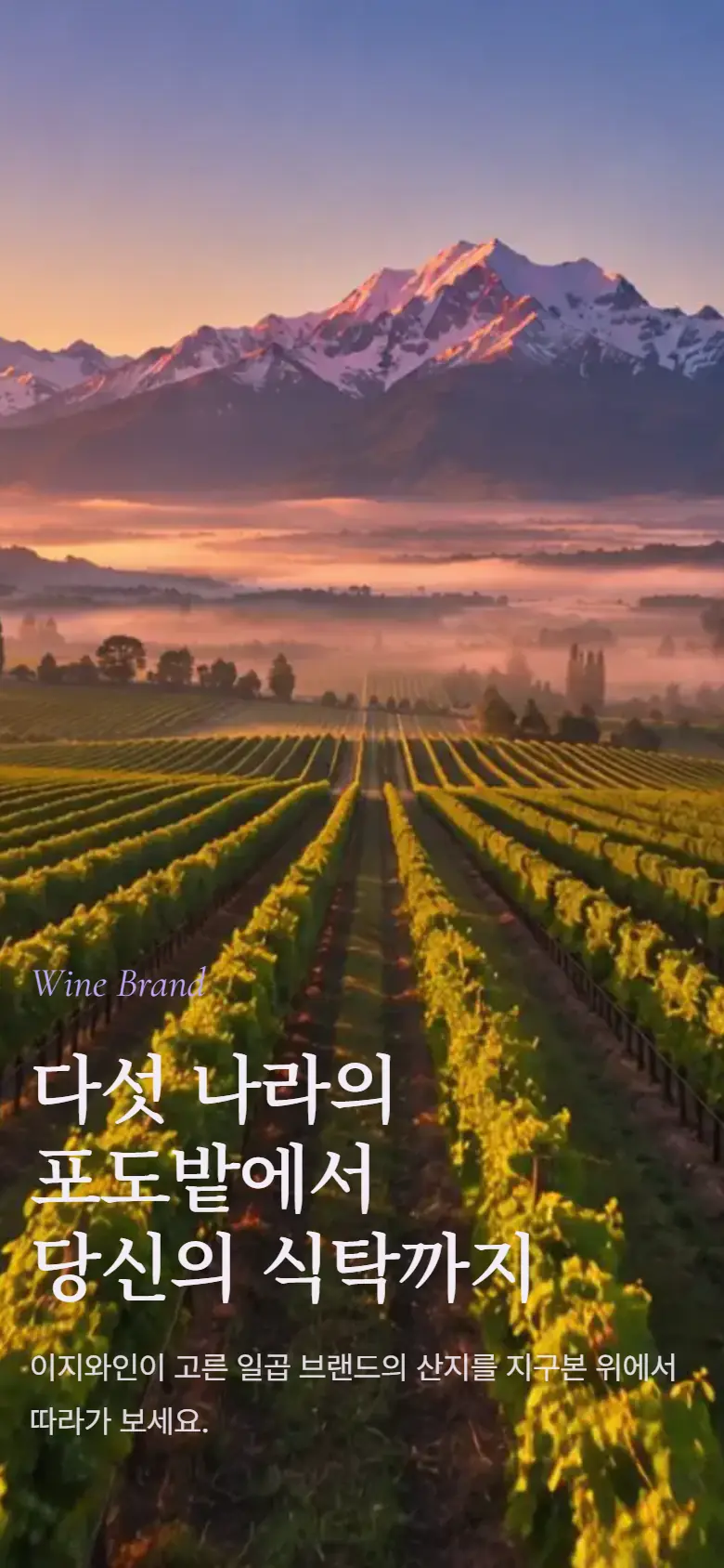
    Below the list of five countries, vineyards spread out at sunset, and “When you open a bottle, the story of that land also opens.”

  7. Good wine. Better together.

    A dinner table with two glasses by candlelight shows a moment of wine.

  8. Some gifts say more.

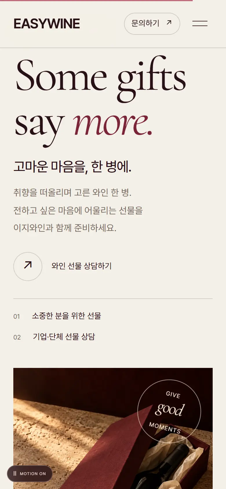
    We placed gift advice and corporate gift advice side by side next to the burgundy gift box.

RUBY IN MOTIONEmpty the middle of the glass

EASY POURFollow the bora of the edges

Proposal B · Edge of the glass

Easy PourEasy to Understand · Approach · Drink

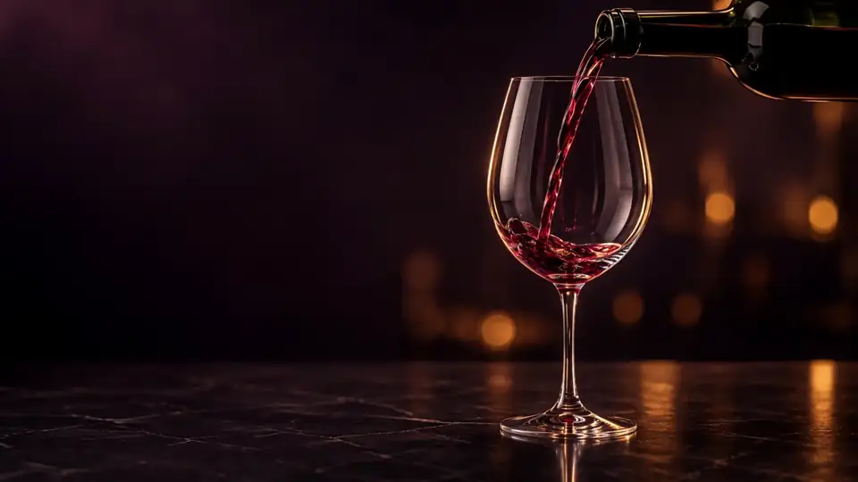
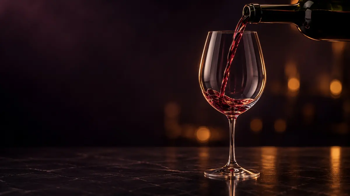
This direction begins with the scene of pouring wine from a bottle into a glass. As you scroll, the wine fills your glass, and the three words Understand, Approach, and Drink change one after another. The lavender logo was used as an accent color, and the company story, brand, wine, gifts, and delivery information were included in order on one page.

  • The first screen and three easy ways to pour wine by scrolling
  • A journey connecting five countries and seven brands on the globe
  • Eight bottles in a cellar where the color of the wine on the bottom changes with each bottle.
  • Pairing that tells you which wine goes well with the food you choose
Cormorant Garamond · Noto Serif KR · Pretendard
DIRECTION NOTES

Among the scenes in Proposal B, I chose a moment that I put a lot of effort into directing. Click on the photo to see a larger view of each scene.

  1. Easy to Understand

    The bottle tips over the dark bar, and wine begins to drip into the glass. The first word is Understand.

  2. Easy to Drink

    When the wine fills the glass, the word changes to Drink, and the screen moves on to the next scene with the wine covering the screen.

  3. Experience is ‘quality’ not ‘quantity’

    We have taken the first sentence of the current company introduction and enlarged it on one screen.

  4. In the vineyards of five countries

    The globe spins, drawing a route from the mountain to Seoul, and the brand story appears on the right card.

  5. Eight bottles taken from the cellar

    Each time the bottle is changed, the color of the wine on the bottom and the large letters on the back change together.

  6. Find the right wine for today's menu

    When you choose one of the eight foods, the matching disease and reason will immediately change.

  7. A wine that is easy to convey

    A 1-pack, a 2-pack, a golf wine set, and a customized corporate gift are gathered in one scene.

  8. How to work together

    Hotel, restaurant, distribution, and event cards are layered one after another.

10 / PROCESSFrom still shots to film

From a single scene
to a scroll film

The video on the first screen of Proposal A started with a still scene of ruby-colored wine surrounding a glass. I slowly moved the camera using the browser's WebGL, calculated 144 frames with the wine's refraction and light flowing, and grouped them into a 6-second video. On the left is the first scene, and on the right is the scene starting to move.

Scene that started moving: One frame at the end of the 6-second video
First scene: A still image of ruby-colored wine surrounding a crystal glass.
  • A mountain scene image
    Mountain regionVineyards running along a hill at sunset. 「From a place. This is the background of the scene. “With a story.”
  • A dinner table scene image
    Dinner tableA table where two glasses clink together under candlelight. Only the hands were visible without the face.
  • A gift box scene image
    Gift boxBurgundy box and champagne colored ribbon. I laid the bottle down so the label wasn't visible.

Twenty Scenes
Two Films

Inside B, there are 20 scene images, including eight pictures of food, six pictures of the place of origin, gifts, and karma scenes. For the first screen and the mountain journey, the first scene was drawn first, followed by a 10-second video, and each frame was selected separately for each aspect ratio (16:9, 4:3, 9:16) and drawn to match the scroll.

First picture of the first scene of Proposal B: Empty wine glass and tilted bottle on a dark bar.
01First scene
02Film for pouring wine
03151 frames × 3 screen ratios

8 DISHES · 8 BOTTLES

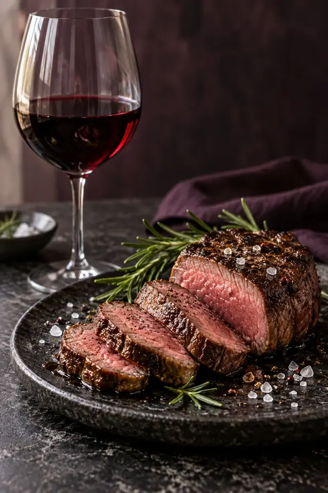
  • Proposal B pairing scene: SteaksteakCavallo Rocco
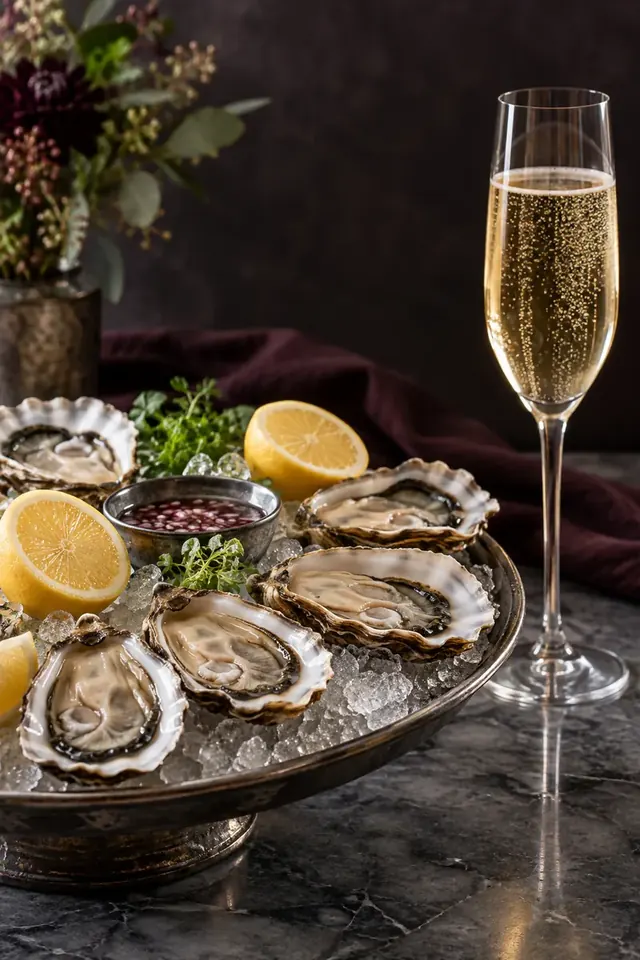
  • Proposal B pairing scene: Oysters and seafoodOysters and seafoodGrand Cuvée 1531
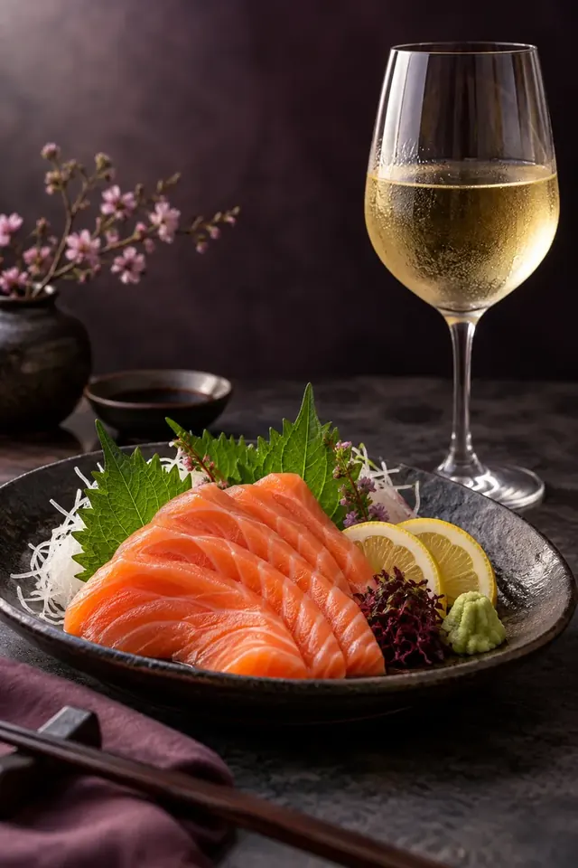
  • Proposal B pairing scene: salmon sashimisalmon sashimiValdivieso Chardonnay
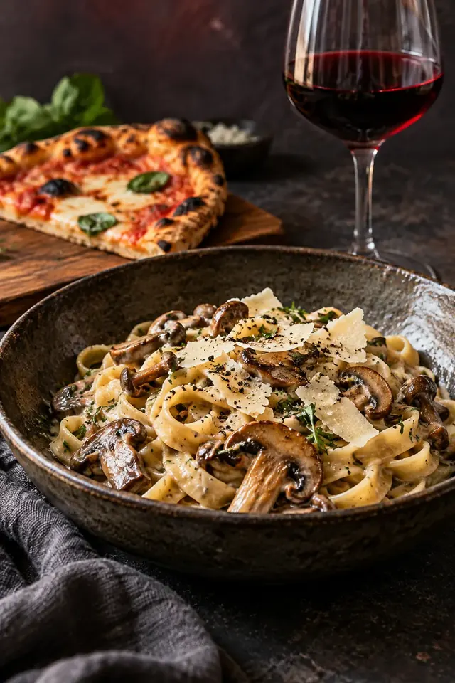
  • Proposal B pairing scene: Pasta · PizzaPasta · PizzaMission Third Cabernet Sirah
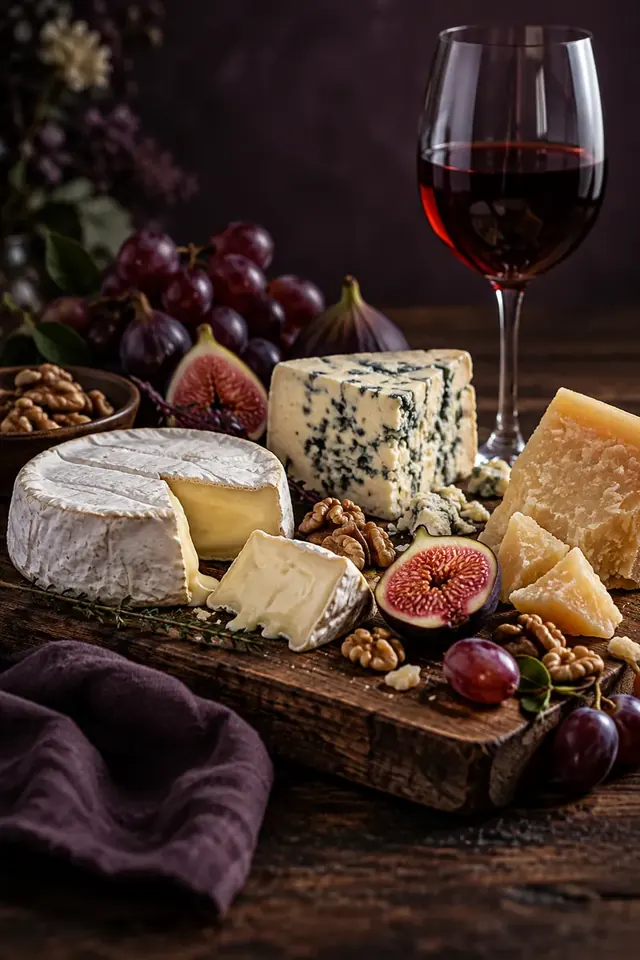
  • Proposal B pairing scene: CheesecheeseCallaway Zinfandel
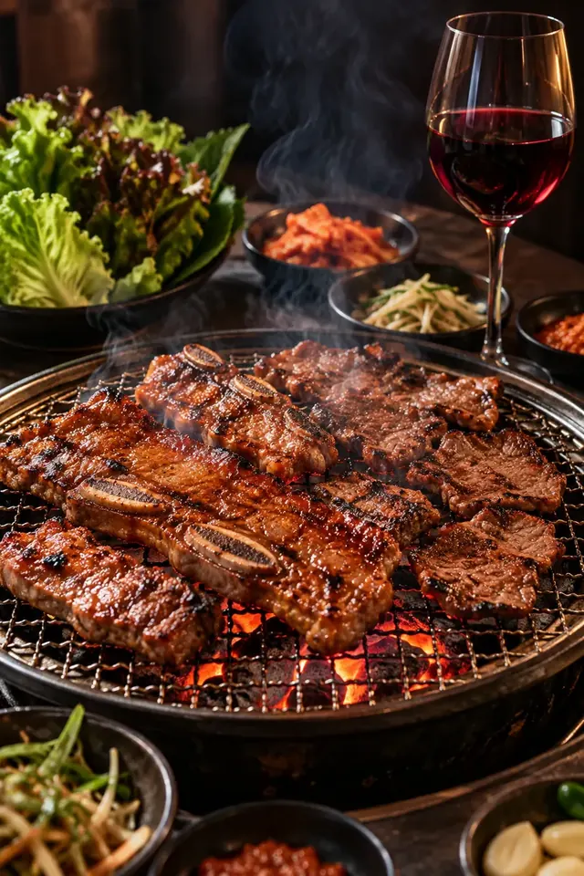
  • Proposal B pairing scene: barbecue · grillingBarbecue · GrilledBaltasar Garnacha Hero
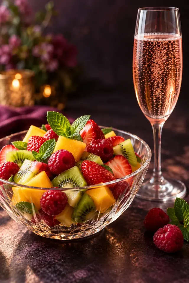
  • Proposal B pairing scene: fruit saladfruit saladPink Elephant Sparkling Rosé
  • Proposal B pairing scene: CakecakeValdivieso Sparkling Moscato
B·Easy Pour·16:9·Production Journey

This is a film where the camera hovers over a vineyard. In the design, the film is scrolled through to open a scene called “In the Vineyards of Five Countries,” which leads to a globe.

A · Ruby in Motion · 16:9 · WebGL

This is a video that adds camera movement, wine refraction, and flowing light to a still scene.

11 / MOBILEMobile

Even on your phone
Slowly, one bottle at a time

People often search for wine to gift and store information on their cell phones. Proposal A changed the horizontal collection on mobile to a list and arrow buttons for swiping with your finger. In Proposal B, the scene following the first screen was created separately as a vertical screen frame.

Proposal A · Home screen Mobile screen
A · Home screen
Proposal B · Home screen Mobile screen
B · Home screen
Proposal A · Collection Mobile Screen
A · Collection
Proposal B · Mountain Journey Mobile Screen
B · Mountain itinerary
Proposal A · production site mobile screen
A·Production area
Proposal B · Seller mobile screen
B · Seller
Proposal A · Gift mobile screen
A · Gift
Proposal B · Pairing mobile screen
B·Pairing
COMPAREHow are the two directions different?

of the same glass
center and edge

The two designs contain the same 25 types of wine and the same company story, but the words they say first on the first screen are different. Proposal A quickly conveys the atmosphere with a ruby-colored video and a short movement line, while Proposal B begins with a scene of pouring wine and spreads out the path to choose from the seller, pairing, and delivery information. EASYWINE has organized the differences so that you can choose according to the scene you want to convey first on the first screen.

SeparationA · Ruby in MotionB · Easy Pour
Home page6-second video of ruby-colored wine surrounding a glass, stops when scrolled and moves back and forth151 frames of pouring wine from bottle to glass, fills up as you scroll
ColorNight ruby, cream, wine red (middle of the glass)Purple chestnut, lavender, wine (rim of the glass)
TypefaceCormorant · PretendardCormorant Garamond · Noto Serif KR · Pretendard
Logo locationLetter wordmark EASYWINECurrent Bora logo
How to choose wineHorizontal collection and type filter, wine detail windowEight bottles in the cellar, list of 25 types and filter, food pairing
Producing regionsGlobe and list of five countriesJourney on the globe and seven brand logos
Gifts · DeliveryGift consultation and inquiry windowGift sets, business · distribution · event information, inquiry form
Place of weightAtmosphere and short movement pathAmount of information and fun to choose
12 / CREDITSBLUECANVAS · WORKS 2026

BACK LABEL · Korean display information

Ruby in the middle, purple on the edges

EASYWINE website renewal proposal · Ruby in Motion · Easy Pour

Product name
EASYWINE website renewal proposal
customer
EASYWINE Co., Ltd. EASYWINE
category
2 main design proposals · Mobile screen · Scroll film
vintage
October 2026
research
25 types of wine, 7 brands, 5 countries, 2015-2016 manuscript
Brand interpretation
Purple logo and rim of the glass, ‘quality’ not ‘quantity’
structure
Five categories of visitors, four criteria for dividing 25 bottles
A · Ruby in Motion
UI design, 6 second WebGL video, landscape collection
B · Easy Pour
UI design, follow scroll film, seller and pairing
typeface
Cormorant · Cormorant Garamond · Noto Serif KR · Pretendard
recommended screen
PC · Tablet · Mobile
Country of origin / production
Seoul, South Korea · BlueCanvas
YOUR NEXT GLASS

If you want to
easily choosea product that feels difficult,

Let's start with the order in which unfamiliar names and many options will be shown.

    Contact

    A rough idea is a good place to start.
    Let’s shape your project together

    Tell us where you are and what you want to achieve. We’ll outline a practical scope, process, and estimated budget.

    4 questions · about 2 minutes

    Scope

    What would you like to work on together?

    Select as many as apply. If you are not sure yet, choose “Other”.

    Budget

    What budget range do you have in mind?

    Even a rough range helps us shape the proposal.

    Project details

    Tell us where you are right now.

    It does not need to be polished. Tap an item below and the outline is filled in for you.

    0

    Upload up to 2 RFPs or reference files. Supported: PDF, PPT, Word, Excel, JPG, PNG, ZIP

    Contact

    Where should we reply?

    Scope, budget, project details and contact information are required.