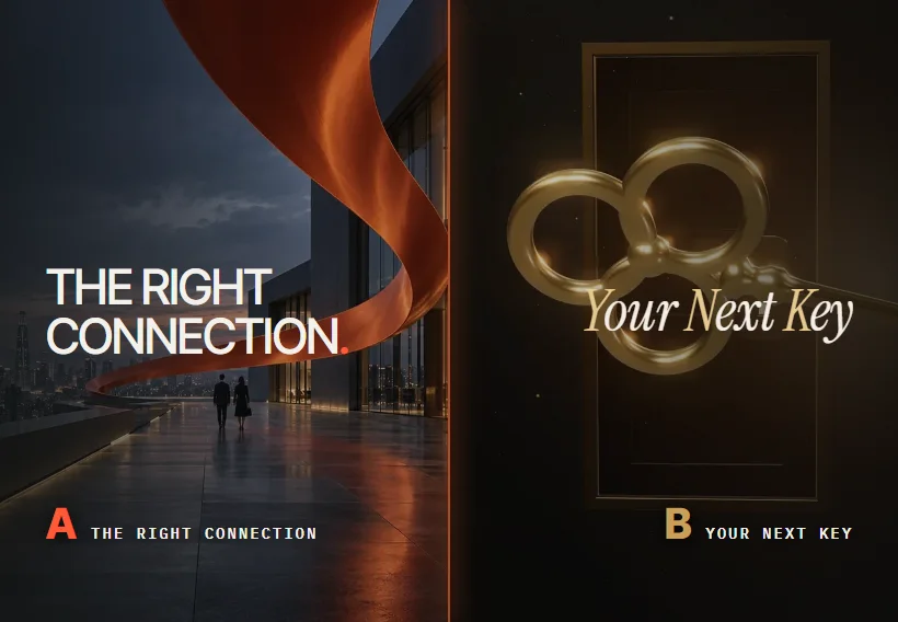
Request a project consultation Skip to project introduction

InPR & OUTCOMIn and out in the logo are
the names of the two companies

IN · READFrom the advertiser's perspective
Read inside

OUT · MOVEMove the world's attention
out

in&outPR · WEBSITE RENEWAL PROPOSAL

Read the insideMove the outside

INPR · OUTCOM homepage renewal proposal
IN & OUT · SIGNAL TO IMPACT two directions

Read case
IN·01 / OVERVIEWProject Overview

A PR consulting group where two companies
work as one team

INPR and OUTCOM are public relations consulting groups that provide total PR services ranging from corporate PR, government and institutional PR, brand PR, IR, and issue and crisis management. INPR Co., Ltd. was established in 2010 and works together with OUTCOM under the name in&outPR. In 2012, he received the Presidential Award for Outstanding Policy Promotion, and in 2014, he received the Minister of Science, ICT and Future Planning Award.

BlueCanvas proposed two directions for redesigning the group's website. IN & OUT, where the & of the logo is drawn with light particles, and SIGNAL TO IMPACT, with the result of chrome ribbon and highlighter lime. This page summarizes the first draft, brand interpretation, structure, color, and movement that led to the two design proposals.

CLIENT
in&outPR
INPR Co., Ltd. · OUTCOM Co., Ltd.
SECTOR
Corporate · Government · Brand PR
IR · Issue · Crisis Management
OUR ROLE
Research, brand interpretation, information structure,
UI design, motion graphics, motion film
DELIVERABLE
5 types of home screen navigation, 2 types of main design proposals,
motion film, mobile screen, color and font guide
  • 2010Establishment of INPR Co., Ltd.
  • 44Cases organized in portfolio
  • 6Total PR Service Area
  • 2Government Awards · 2012 Presidential Award, 2014 Ministerial Award
IN·02 / CHALLENGEStarting point

The main screen of the current website
  1. 1The phrase “PR solution group” is placed above the slide banner.
  2. 2The three core competencies are shown in numbered boxes.
  3. 3Cases are long with Issue and Solution & Outcome bullet points in the “Latest News” card.

FOUR QUESTIONS

Renewal started with
Four Questions

  1. Q1
    Can you see what kind of PR company it is on the first screen?

    In both designs, the first screen started with the company name. It shows what in and out, and the & between them mean.

  2. Q2
    Would the forty-four cases be seen as a result rather than a list?

    In each case, I found a single line of results in the long bullet list and put it at the forefront with numbers and photos.

  3. Q3
    How do we make invisible things like crisis management visible?

    Proposal A is a scene where tangled lines are organized into a single signal, and Proposal B is a list of services that go from issue diagnosis to situation response.

  4. Q4
    Will it be conveyed that the two companies are one team?

    &, which connects the names of the two companies, was used as a symbol of the entire website.

Western Networks

Marketing PR, media PR

  • Period: 2022 ~ Present
  • Issue:
  • – Unformed media interest compared to the growing children’s clothing market
  • – Media publicity was insufficient compared to the high level of awareness within the industry and consumer purchasing power.
  • Solution & Outcome:
  • – Increasing industry awareness in the children’s clothing market, where there was no such thing, by actively promoting our own brand along with the title of No. 1 children’s clothing company
  • – Strengthening concepts and building premium images tailored to each brand’s identity
  • – Inducing interest in the children’s clothing market revitalizes the overall market and increases interest, thereby increasing corporate awareness
  • – Maintain continued interest in children’s clothing by promoting various seasonal issues in line with trends within the fashion industry.
  • – Increased article coverage by 405% in 22 years compared to the same period of the previous year since the start of media promotion

READ THE RECORD

The results were in the seventh
bullet

There are seven bullet points on the Western Networks case card on the current website. The biggest achievement, 405%, is written at the end of the last line of them. In each case, the two design proposals found this one line and brought it out to the middle of the screen.

0%Western Networks · 2022 article coverage
Year-on-year growth rate

Proposal A shows these numbers as number cards between examples, and Proposal B shows these numbers as lavender colored sheets of numbers.

IN·03 / FIRST DRAFTFirst manuscript

The first manuscript
never made it past the desk

The first five screens were drawn in February 2026. The plan was to post a sentence like “Conveying the value of the brand to the world” on top of a photo of the same office and only change the layout and font. I re-read the five chapters as if the editorial desk was revising an article, and it was a screen that wouldn't look out of place in any PR company.

  1. The first screen of the first draft, February 2026: A red title and button were posted above the office photo.
    Plan 12026.02A red title and button were posted above the office photo.
  2. The first screen of the first draft, draft 2, February 2026: Three numbers are placed next to the title of Gina Myeongjo.
    2nd plan2026.02 Three numbers are placed next to the title of Myeongjo.
  3. First screen of the first three drafts in February 2026: The English serif title was enlarged in the center of the screen.
    3 An2026.02The English serif title was enlarged in the center of the screen.
  4. The first screen of the first draft, February 2026, with a bright office photo and lime green underlining.
    4 Eyes2026.02I used a photo of a bright office and a lime green underline.
  5. The first screen of the first five drafts in February 2026: The screen was divided in half and numbers were stacked on the right.
    5 Eyes2026.02The screen was divided in half and the numbers were stacked on the right.
  1. DESK NOTE 01 · PHOTOOffice photos do not show PR

    All five of them used the same office photo. The work of a PR company is revealed in articles, broadcasts, and at the scene of a crisis rather than in the boardroom. In the second manuscript, we started with the company name instead of the photo.

  2. DESK NOTE 02 · COPYI do not write sentences that are suitable for any company.

    “Conveying the value of the brand to the world” is a sentence that any PR company can use. I re-read the logo to find sentences that only INPR and OUTCOM could use.

  3. DESK NOTE 03 · FACTOnly confirmed numbers are left

    The first manuscript contained numbers such as Since 1990 and 200+. The CEO has 30 years of experience, and the company was founded in 2010. In the second manuscript, only the numbers confirmed by public data were left.

IN·04 / BRANDBrand interpretation

There were
two companies and two directionsin the logo.

We re-read the current logo before creating the new emblem. The entire story of the website is drawn from the thin gray letters in&out, the bold turquoise PR, and the small & in between.

01 · TWO NAMES

INPR and OUTCOM

in and out come from the names of two companies that work together. The in of INPR (InPR) and the out of OUTCOM (OUTCOM). The logo contains two companies side by side in one line.

02 · AMPERSAND

Connecting the two &

The & between the two names is a symbol that unites the two companies as one team. The only letters colored in turquoise in the logo are & and PR. Both design proposals made this small & the main character of the website.

03 · TWO DIRECTIONS

Read the inside, move the outside

In and out are also the two directions in which PR works. Reading the inside from an advertiser's perspective becomes strategic consulting, and moving the outside through broadcasting, newspapers, and online becomes strong execution power.

04 · ONE SURFACE

uninterrupted side

If you follow the inner surface, there is a strip that reaches the outer surface. It is a Möbius strip. The idea that the story found inside continues outside without interruption is captured in the chrome ribbon inside B.

05 · TWO COLORS

gray and turquoise

There are two colors used in the logo: gray #53585E and turquoise #3A90A9. Proposal A continued this teal color, and Proposal B chose lime highlighter instead of teal.

IN·05 / MOODBOARDMood Board

I chose the words first
and collected the scenes

The words that emerged from the brand interpretation were reading, transmission, entry, signal, and city. We selected scenes that fit each word and used them as materials for the two designs. This is to convey the atmosphere of the PR site without having to borrow the client's advertising photos.

  1. This is a desk where article clippings and reports are spread out. It demonstrates reading a situation from an advertiser's perspective.
    01READReadProposal A · Strategic consulting
  2. This is the broadcast sub-control room with a full screen. This is the moment when the message goes out on the air and in newspapers.
    02ON AIRTransmissionProposal A · Strong execution
  3. This is the press conference podium with microphones gathered around. This is an opportunity to present the company's position in the face of a crisis.
    03STATEMENTPositionProposal A · Issue · Crisis Management
  4. This is Jeju’s valley water flowing between volcanic rocks.
    04SOURCESourceProposal A · Portfolio
  5. It is a chrome ribbon painted lime green only on the inside. The inside and outside are connected without interruption.
    05SIGNALSignalB · Home screen
  6. A night intersection in Seoul with an empty lime-colored electronic signboard. We left an empty space for the brand’s story.
    06CITYCityProposal B · City Scene
  7. These are people running along the riverside at dawn.
    07MOVEMoveProposal A · Portfolio
  8. A hiker in a red jacket standing on a foggy ridge. This is the first scene of an outdoor brand case.
    08SUMMITRidgeProposal B · Representative example
  9. Expo visitors walking between light installations.
    09CROWDVisitorsProposal A · Portfolio
  10. This is a window overlooking the Han River. It becomes the background for the door scene.
    10NEXTNext StoryProposal A · Inquiry
IN·06 / STRUCTUREVisitors and information structure

There were
four types of people who opened the PR company homepage

The PR company's website is visited not only by public relations personnel looking to entrust work, but also by public institution officials and reporters. Some people are urgently looking for contact information in times of crisis. Since each person visiting had different information they wanted to check, we first decided which scene each person would arrive at.

  • 01Corporate/Brand Public Relations Manager

    Find out what brands they worked with and what the results were.

    Representative examples and performance numbers
  • 02Public institution representative

    We are looking for government/institutional PR experience and award history.

    History · Awards
  • 03A company in crisis

    Start by finding out how to respond and how to contact them right away.

    Crisis Management / Inquiry
  • 04Journalists and industry insiders

    Find out about the company and who they work with.

    Introduction · People

The homepage was designed
like a press release.

Press releases follow an inverted pyramid structure, with the most important content first. This is so that reporters can understand what happened just by reading the first paragraph. The main screens of both designs were organized in the same order. The further down you go, the more detailed the content becomes, and at the end you are left with a way to contact us.

  1. IN & OUT first scene 01 · HeadlineIn one sentence, what the company does. MAKE AN IMPACT.
  2. Three forces that create results 02 · LeadThe forces that produce results are reduced to three. INSIGHT · STORY · IMPACT
  3. Total PR Service Wheel 03 · BodySix services are presented. Six service accordion
  4. Portfolio · History 04 · EvidenceProven by examples, numbers, history and awards. Representative example · 405%
  5. Inquiry card with a view of the Han River 05 · Contact informationI leave a way to contact you at the end. Inquiry email to select a field

Currently, the website menus About · Expertise · Portfolio · Contact are read in this order on one main screen.

OUTNow, it's time to export
out.

What you read in IN

OUT·01 / COLORColor chart

One turquoise
one highlighter

Eye A inherited the turquoise #3A90A9 of the logo and only shifted the brightness up or down. On a dark background, light cyan appears like light, and on a light background, deep cyan supports the letters.

For Proposal B, instead of cyan, I chose lime, a highlighter used on article clippings. The fact that the color is applied only to one important line is similar to the job of PR, which is selecting a message to convey among a large amount of information.

CI Teal#3A90A9& and PR in the logo
  1. Brightening toward the lightTeal Hi#62C5D7Emphasis and light particles on a dark background · Proposal A
  2. Down toward the shadeTeal Lo#1B6880Small letters on a bright background · A
  3. Change to highlighterHighlighter Lime#D7FB48Color for drawing only on one important line · Proposal B
  4. Lime's PairCoral#FF785AWarm background of inquiry scene · Proposal B

A · IN & OUT

Darkness inside and light outside
  • Background · 48%This is a deep ink color that colors the inside of the sheet. Light particles and cyan letters are most clearly visible.

  • Outside · 32%This is the background of the bright field that unfolds after passing the OUT letters. I mixed in just a little bit of cyan energy.

  • Logo · 9%The & in the logo and the turquoise color used in the PR were moved as is. Used for accents and buttons on a bright background.

  • Light · 7%It is a color that brightens cyan toward the light. Write highlighted letters and light particles on a dark background.

  • Shade · 4%This is a color that lowers turquoise towards the shade. Write the year numbers and small letters on a light background.

B · SIGNAL TO IMPACT

chrome and highlighter
  • Background · 40%Black with chrome ribbon placed on it. It was close to neutral without any blue vibes.

  • Paper · 30%This is the basis for the introduction and process chapters. It reminded me of the off-white color of newsprint.

  • Highlighter · 17%This is the color of the highlighter used to draw important lines in article clippings. Write one word in the title and a service chapter.

  • Dialogue · 8%This is the basis of the inquiry scene. We invite conversation with warm colors that do not clash with lime.

  • Base · 5%This is the basis of the performance sheet, which shows the number 405% and the history of awards.

Clicking on a color swatch will copy the HEX value. The numbers in the sample are the contrast in brightness with the color of the text above them.

OUT·02 / TYPOGRAPHYTypeface

Listen carefully,
Speak boldly

The in&out in the logo are in thin letters and PR is in bold letters. Proposal A moved this contrast to two thicknesses of Plus Jakarta Sans: 300 and 800. The samples below change in thickness from 200 to 800 as you scroll.

For Proposal B, I chose Barlow Condensed, which contains many letters in a narrow width, like a newspaper title. Hangul was set to Pretendard in both designs.

Plus Jakarta Sans · Proposal A logo and titlewght 200

in&outPR

Barlow Condensed · Proposal B title600

MAKE
AN IMPACT.

GOOD IDEAS. REAL IMPACT. · WORK THAT WORKS.

Archivo · Proposal A transition letterwdth 112 · 800

OUT

Write in the transition between dark and light chapters.

Pretendard · Korean text400 · 600 · 800

Read the inside,
Move the outside.

Read from the advertiser's perspective and move the world's attention.

OUT·03 / MOTIONMotion principles

Collect what is scattered
Spread what you have collected

Movement in both designs follows one rule. When you scroll down, the scattered things are collected, and the gathered things spread outward again. The PR sequence of reading the inside and moving the outside has been translated into action. The four cards below actually move along the scroll.

Frame of the first scene of Proposal A: The process of light particles gathering and then spreading
01 · SCROLL = PLAYHEAD

Scrolling playhead

The light particles in the first scene of Proposal A are drawn according to the scroll position in 160 frames. As you pass this card, the frames are passed in the same way.

02 · NOISE → SIGNAL

From noise to signal

In the crisis management scene in Proposal A, the tangled lines are organized into a single signal along the scroll. The same lines are organized on this card as well.

03 · THROUGH THE WORD

transition through letters

Proposal A goes into the word OUT and moves from the dark chapter to the light chapter. The & scene on this page was created the same way.

04 · VIDEO SCRUB

Video that rewinds back and forth

The chrome ribbon inside B plays a 5-second video back and forth according to the scroll position. When lowered, the ribbon spins, and when raised, it rewinds.

Proposal A

IN & OUTRead from the advertiser's perspective and move the world's eyes

This direction uses the & in the logo as the door. In the first screen, scattered light particles gather into one & and then spread out as waves. The dark IN chapter talks about the company's thoughts and crisis management, and when you pass the word OUT, the bright OUT chapter shows examples and history.

  • 160 frame first scene where light particles gather and spread with &
  • Total PR Service wheel that spins six services
  • A crisis management scene where tangled lines are organized into a single signal.
  • Transition through the letters OUT and into the bright field
Plus Jakarta Sans · Archivo · Pretendard
DIRECTION NOTES

Among the scenes in Proposal A, I chose a moment that I put a lot of effort into directing. Click on the photo to see a larger view of each scene.

  1. IN · Light gathers with &

    Scattered light particles gather into one & along the scroll. IN is placed on the left and OUT is placed on the right.

  2. OUT · Spread as a wave

    & explodes and becomes a round wave that spreads out of the screen. The first scene ends here.

  3. Three forces that create results

    Strategic consulting, strong execution ability, and issue/crisis management are overlapped with three cards.

  4. Total PR Service Wheel

    As you scroll down, the wheel turns and the six services turn on one after another.

  5. From noise to signal

    The tangled lines are organized into a single signal along the scroll, and the five stages of crisis response follow.

  6. pass OUT

    The word OUT grows larger, and when you enter it, the dark chapter ends and a bright chapter opens.

  7. story brought out

    A portfolio of mixed photo and number cards flows horizontally.

  8. History since 2010

    The year numbers roll over like a dashboard, showing customers who have been with us each year.

Proposal B

SIGNAL TO IMPACTThe potential within the brand, into influence outside the world.

It is a direction that puts the results of PR at the forefront with a chrome ribbon and highlighter lime that connects the inside and the outside as one. When you scroll down, a 5-second ribbon video plays at that speed, and a lime green service sheet flows horizontally, followed by a representative example and the number 405%.

  • Chrome ribbon video that scrolls back and forth
  • INSIGHT · STORY · IMPACT Three lime-colored service sheets flowing horizontally
  • Representative examples and detailed windows that can be filtered by field
  • Inquiry email filled with content when you select your field of interest
Barlow Condensed · Pretendard
DIRECTION NOTES

Among the scenes in Proposal B, I chose a moment that I put a lot of effort into directing. Click on the photo to see a larger view of each scene.

  1. MAKE AN IMPACT.

    A large title is placed above the chrome ribbon. A small window in the lower right leads to a city scene.

  2. IT STARTS WITH YOU.

    As you scroll down, the ribbon video plays forward and the second sentence appears.

  3. IN. ↗ OUT.

    The sentence that connects the potential within the brand to influence outside the world is summarized in two words: IN and OUT.

  4. city ​​night

    A message panel floats above an intersection lined with blank lime green signs.

  5. lime green service cabinet

    INSIGHT, STORY, IMPACT The three sheets flow horizontally along the scroll.

  6. WORK THAT WORKS.

    The representative example is to fill the screen with photos and filter them by field.

  7. 405%

    The lavender sheet shows 405% of Western Networks and two government awards.

  8. LET’S MAKE SOME IMPACT.

    If you select a field of interest, an inquiry email containing that information will open.

OUT·06 / MOTION FILMMotion Film

& Made with one
8 second film

The light particle scene used in the first scene of Proposal A was also made into an 8-second film. The horizontal video was prepared in two ratios so that it could be used on the website and presentation materials, and the vertical video could be used on social media. There is a video of the chrome ribbon in B rotating once for 5 seconds.

A · IN & OUT · 16:9 · 0:08

This is a video where light scattered like dust gathers, explodes into a round wave, and then returns to darkness.

A · 9:16 · 0:08

The same scene was rearranged to fit the vertical screen.

B · SIGNAL TO IMPACT · 0:05

This is a video of a chrome ribbon painted lime green on the inside turning slowly. It repeats silently.

OUT·07 / MOBILEMobile

Even in the hand
Same signal

Reporters and public relations staff often open websites on their mobile phones while on the go. Cases and services that flowed horizontally were changed to run vertically, and the length and font size of fixed scenes were redefined to fit the vertical screen.

Proposal A · Light gathered & mobile screen
A · Light gathered &
Proposal B · Home screen Mobile screen
B · Home screen
Proposal A · Service wheel mobile screen
A · Service wheel
Proposal B · Lime green service cabinet mobile screen
B · Lime green service cabinet
Proposal A · Number card mobile screen
A · Number card
Proposal B · 405% mobile screen
B · 405%
Proposal A · History Mobile Screen
A · History
Proposal B · Inquiry Mobile Screen
B · Inquiry
COMPAREHow are the two directions different

Two voices
introducing the same company

The two designs contain the same content, but what they say on the first screen is different. Proposal A first states the company's name and thoughts, and Proposal B states the results and numbers first. We've organized the differences so that companies can choose based on what they want to say first on the home screen.

SeparationA · IN & OUTB · SIGNAL TO IMPACT
First screen160-frame scene where light particles gather and spread in &Chrome ribbon video and MAKE AN IMPACT.
ColorDark blue · Logo's cyan · Bright paperBlack · Newsprint · Highlighter Lime · Coral
TypefacePlus Jakarta Sans · ArchivoBarlow Condensed
How to show the serviceTotal PR Service Wheel to turn the six areasINSIGHT · STORY · IMPACT rail and six service accordion
How to present examplesPortfolio with photo and number cards flowing horizontallyRepresentative examples with field filters and detail window
Crisis managementA scene where tangled lines are organized with signals and three cases of actual responseIntroduced in the list of services from issue diagnosis to situation response
Scene changeFrom dark to light through OUT lettersChange background color for each sheet to lime, paper, lavender, coral
InquiryInquiry card above a photo of a window overlooking the Han RiverEmail filled with content when you select an area of ​​interest
Place of weightCompany name and crisis management know-howResults, numbers, and first inquiry
Press release · PRESS RELEASEAvailable immediately after distribution

BlueCanvas·WORKS

BlueCanvas, two suggestions for in&outPR website renewal

IN & OUT starting from & in the logo, SIGNAL TO IMPACT with results in the limelight highlighter

Seoul, October 23, 2026. BlueCanvas proposed two homepage renewal directions for PR consulting group INPR · OUTCOM (in&outPR). The two ideas started from the interpretation of in and out in the logo as the names of two companies and the two directions in which PR works.

The first plan, IN & OUT, begins with a scene where scattered light particles gather into one & and then spread out like waves. The second plan, SIGNAL TO IMPACT, put examples and achievements at the forefront with a chrome ribbon video and highlighter lime. In both plans, only numbers confirmed from public data were used, and even the mobile screen was designed together.

Client
in&outPR · INPR Co., Ltd. · OUTCOM Co., Ltd.
Project
website renewal proposal October 2026
Research
Company introduction · Service scope · Summary of 44 cases
First Draft
Five first screens for February 2026
Brand Reading
In·&·out interpretation of the logo, keywords and mood board
Structure
Visitor definition, inverted pyramid information structure
Direction A
IN & OUT · UI design, 160 frame first scene, motion film
Direction B
SIGNAL TO IMPACT · UI design, scrolling video, inquiry email
Mobile
Vertical screen scene reconstruction and inspection
Typefaces
Plus Jakarta Sans · Archivo · Barlow Condensed · Pretendard
Studio
BlueCanvas
YOUR NEXT RELEASE

How is your companyreadoutside the world?

The homepage is the first press release that the company puts out to the world.
Let's read it again, starting with the company's name and records.

    Contact

    A rough idea is a good place to start.
    Let’s shape your project together

    Tell us where you are and what you want to achieve. We’ll outline a practical scope, process, and estimated budget.

    4 questions · about 2 minutes

    Scope

    What would you like to work on together?

    Select as many as apply. If you are not sure yet, choose “Other”.

    Budget

    What budget range do you have in mind?

    Even a rough range helps us shape the proposal.

    Project details

    Tell us where you are right now.

    It does not need to be polished. Tap an item below and the outline is filled in for you.

    0

    Upload up to 2 RFPs or reference files. Supported: PDF, PPT, Word, Excel, JPG, PNG, ZIP

    Contact

    Where should we reply?

    Scope, budget, project details and contact information are required.