Two companies named
The name of the foundation comes from Hansae YES24 Holdings. The name includes Hansae Co., which makes clothes, and YES24, which sells books. Before rebuilding the website, I read these two names again.
HANSAE YES24 FOUNDATIONWEBSITE RENEWAL PROPOSAL
Hansae YES24 Foundation homepage renewal proposal
Beyond Borders · One thread, two directions
BLUECANVASYES24 · Book2026
HANSAE YES24 FOUNDATION · CASE STUDYHansae YES24 Foundation homepage renewal proposal
When you scroll down, the gold thread begins to weave the cloth
THREAD · HansaeI found a
thread in the name of Hansae Co., which makes clothes.
SINCE 2014The foundation was launched to connect
culture with the ASEAN countries that shared the growth of Hansae Co.
PAGE · YES24I found a
book in the name of YES24, which sells books
Hansae YES24 Foundation is a public interest foundation launched in April 2014 by Dongnyeong Kim, Chairman of Hansae YES24 Holdings, contributing his personal funds. Based on the growth achieved by Hansae Co., the foundation's parent company, in Southeast Asia, it has laid a cultural path between Korea and ASEAN by holding international cultural exchange exhibitions and publishing a series of Southeast Asian literature. Humanities research and scholarship projects, Uidang Love Sharing, and Hanse Classic Lied, a song performance that began in 2024, are also the foundation's work.
BlueCanvas has created and managed the current foundation website, and for the 2025 “Thai Contemporary Art: Dreams and Thoughts” exhibition, we created 25 audio guide pages that can be opened with a QR code next to the work. This time, we redesigned the main page to show the foundation's work on the first screen, and proposed two directions: Beyond Borders and One Thread.
FOUR QUESTIONS
The current website is structured so that you can quickly find notices and application information. In the meantime, the foundation's work expanded to include exhibitions, books, and performances.
There is now a line of vision statements on top of the photo slides. Both design proposals describe in one sentence what the foundation does on the first screen.
Proposal B created a horizontal scene linking the exhibition in chronological order and a separate bookshelf with seven books, while Proposal A included four business cards and cultural stories.
The announcement of the contest and selection is the news applicants are waiting for. In both design proposals, notices were listed below the first screen, and Proposal A had notices and cultural news shared.
Proposal A is “Four Ways to Share Culture,” and Proposal B ties together the four projects with a film in which a single thread passes through an exhibition, a book, and a stage in turn.
We re-read the current name and logo before creating the new emblem. The starting point for the two designs was found in the words HANSAE and YES24, which are attached like one word, and the two colors of blue that separate the two names.
The name of the foundation comes from Hansae YES24 Holdings. The name includes Hansae Co., which makes clothes, and YES24, which sells books. Before rebuilding the website, I read these two names again.
Looking at the logo colors, HANSAE is dark blue #17478E, and YES24 is bright blue #007DC3. Although they are written together as one word, they are divided into two names by color.
The foundation's predecessor, Hansae Co., is a clothing manufacturing company that grew by doing business in Southeast Asia. The foundation was launched to deepen cultural exchanges with those countries, and in 2016 it held an exhibition with Indonesian textile batik. We were reminded of a thread in this name.
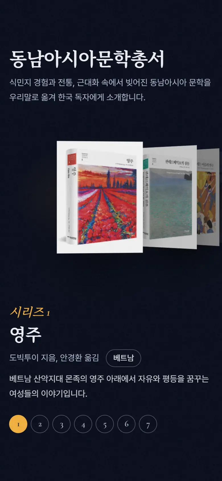
YES24 is a company that sells books. The foundation translated Southeast Asian novels into Korean and published them in seven volumes, and also operates an electronic library used by foundation project participants and group executives. This name reminded us of a chapter from a book.
Proposal B, One Thread of Thread, opens with “A relationship that started with a single thread,” and Proposal A, Beyond Borders, opens with “A meeting that started with a single book.” This is a design proposal that I read starting from the same foundation and a design proposal that I read starting from a book.
The 87 cases listed in the history of the official website were divided into six threads according to the type of work. A vertical line is a year, and each knot is a record.
February 2014Founding Board of Directors
The International Cultural Exchange Exhibition is an exhibition that introduces artists and works from Southeast Asia to Korea. Starting with Vietnam in 2015, we have worked with writers from six countries, and there are 92 writers whose names are listed on the official website. I followed the thread from each country to Seoul in the order in which the exhibition was held.

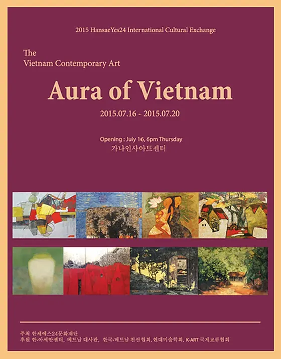
20151 / 7 · Vietnam
2015. 7. 16.~7. 20. · Seoul Insa Art Center
14 writers
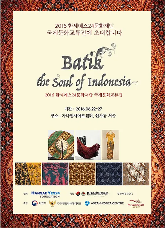
20162 / 7 · Indonesia
2016. 6. 22.~6. 27. · Seoul Insa Art Center
4 Artists and Batik World Design Winners
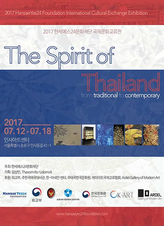
20173 / 7 · Thailand
2017. 7. 12.~7. 18. · Seoul Insa Art Center
19 writers
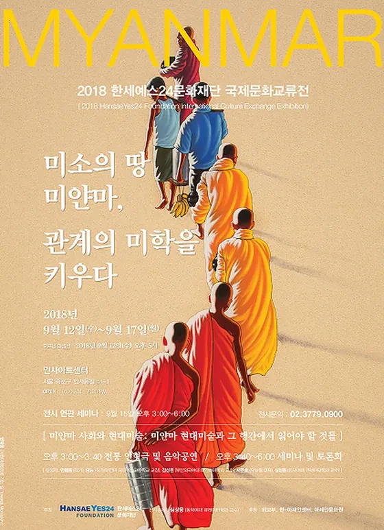
20184 / 7 · Myanmar
2018. 9. 12.~9. 17. · Seoul Insa Art Center
8 writers
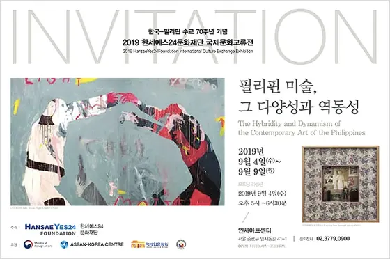
20195 / 7 · Philippines
2019. 9. 4.~9. 9. · Seoul Insa Art Center
11 writers
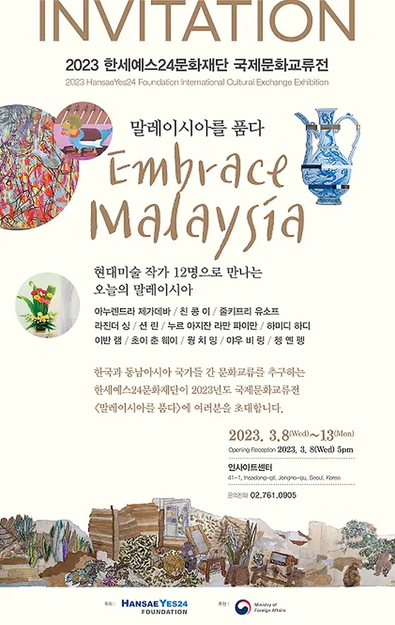
20236 / 7 · Malaysia
2023. 3. 8.~3. 13. · Seoul Insa Art Center
12 writers
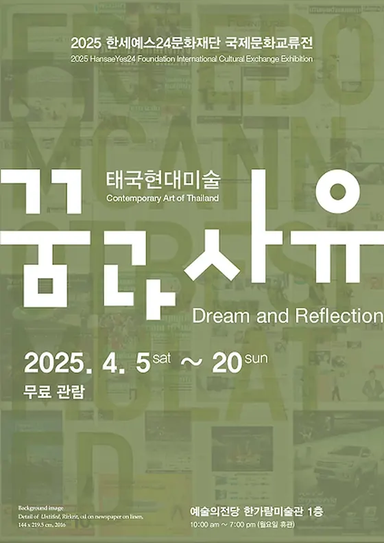
20257 / 7 · Thailand
2025. 4. 5.~4. 20. · Hangaram Art Museum, Seoul Arts Center
24 writers
 1 · Vietnam
 2 Indonesia
 3 · Thailand
 4 · Philippines
 5 · Philippines
 6 · Philippines
 7 Indonesia
BOOKSSoutheast Asian Literature Series
The seven volumes of the Southeast Asian Literature Series are one from Vietnam, two from Indonesia, one from Thailand, and three from the Philippines. The thin thread on the map is the length of the book, and the thicker it is, the more books there are.
The foundation's website is visited by people who want to apply for scholarships and research support, people who come to see exhibitions and performances, readers looking for books, researchers, reporters, and sponsors. Since each person visiting had different information they wanted to check, we first decided which scene each person would arrive at.
Check the competition schedule, application method, and selection announcement for the Global Fellowship and Humanities Research Support Project.
Foundation News/ApplicationFind records of upcoming exhibitions, performances, and past exhibitions.
International Cultural Exchange Exhibition · LiedSearch for Southeast Asian literature series, published materials, and research materials.
Literature series and data roomCheck out the foundation's introduction, path taken, and press releases.
Foundation introduction and historyFind out how to donate, details on how donations are used, and the e-library.
Sponsorship · Electronic libraryIn both designs, the foundation is introduced in one sentence in the first scene, goes through the business and story, and reaches the road together at the end. Proposal A was a quick overview of six scenes, while Proposal B was a long walk through nine scenes, with separate scenes for the exhibition, book, and music. The colored dots are what each scene shows.
A · Beyond Borders6 scenes
B · One threadScene 9
For the logo, HANSAE is in dark blue and YES24 is in bright blue. Proposal B created an indigo background by bringing Hanse's navy blue down to the night sky, while Proposal A left the blue only in the logo and changed the background to the paper color of the bookshelf.
RGB 23 71 142 · Dark blue
→ B Indigo Night#060B1ARGB 0 125 195 · Bright blue
→ Proposal A Paper#F3F1E9 Paper → Paper
Water → Emerald Ink
Ribbon → Coral
Proposal A reminded me of a desk exposed to morning sunlight. A book wrapped in emerald cloth, a coral ribbon, and an eight-petal paper flower were placed on top of the ivory paper.
Proposal B reminded me of a workbench at night with only one lamp on. Gold thread spools, batik cloth, and beeswax drawing tools were placed on the indigo cloth. You can compare the two materials by dragging the center line left or right.


Background · 53%The paper color is a little warmer than Korean paper. It was used instead of white to make the photos and text look like they were printed on paper.
Text · Business Scene · 18%This is the basis of the main text and the “Four Ways” scene. Instead of black, I used deep green as the ink color.
Emphasis · Last scene · 21%This is the color of the period, “Continuing”, business card, and the last scene.
Line · 2%This is the color of the thin line that divides the chapter.
Humanities Future Growth Card · 1%This is the basis for the second business card.
Uidang Love Sharing Card · 5%This is the basis for the third business card.
Background · 63%This is the color of an indigo cloth pulled down to the night sky. I left it darkest so that the film on the first screen continued across the entire page.
Scene · 26%This is the basis of the exhibition, bookshelves, and news scenes.
Card · 7%Color of the card and border.
Thread · Emphasis · Less than 1% Gold thread, year, and color of the sponsorship button. Even though it makes up less than 1% of the screen, your eyes go to this color first.
Light · Less than 1%This is the color of the part where light hits the thread.
Text · 2%This is the color of the text on a dark background.
Clicking on a color swatch will copy the HEX value. The number in the sample is the brightness contrast with the color of the text above it, and the ratio is a value calculated by counting the pixels closest to each color in scene captures in the two designs.
Proposal A lightly writes the Korean title as Pretendard 500 and changes only one or two English words to Instrument Serif italics to give it a handwriting-like rhythm. Numbers are written in large letters in DM Sans.
For Proposal B, the Korean title was written in Maruburi, a brush stroke, and the English text was set in Cormorant Garamond italics. The main text is Pretendard for both designs.
BeyondBeyond borders.
Korea and ASEAN
connected through culture
Korean title500 / -0.06emOpen with culture,
connect with people.
We believe that culture connects people.
400Since 2014↗
Four ways to connect.
Italic 500Towards a Sustainable Cultural Future
Towards a sustainable culture tomorrow
The movement in A follows the speed of the hand opening the book, and the movement in B follows the speed at which the thread passes through the fabric. In both cases, scrolling drives the movement, and when the operating system reduces the motion, it only shows the last scene. The four cards below actually move along the scroll.
The arch on the first screen of Proposal A spreads its corners as you scroll and expands to cover the entire screen. The arch on this card also opens in the same way as it passes.

The first scene in Proposal B draws 237 frames according to the scroll position. While passing this card, 60 of them are passed in the same way.
In the introductory sentence in Proposal A, the gray letters become darker word by word as you scroll, and the paper flowers next to them rotate together. The coat of arms and flowers on this card move in the same way.
Proposal B hangs the seven exhibition posters on a strand of gold thread and changes vertical scrolling to horizontal movement so that the artist walks along the thread. The thread and poster on this card also flow along the scroll.
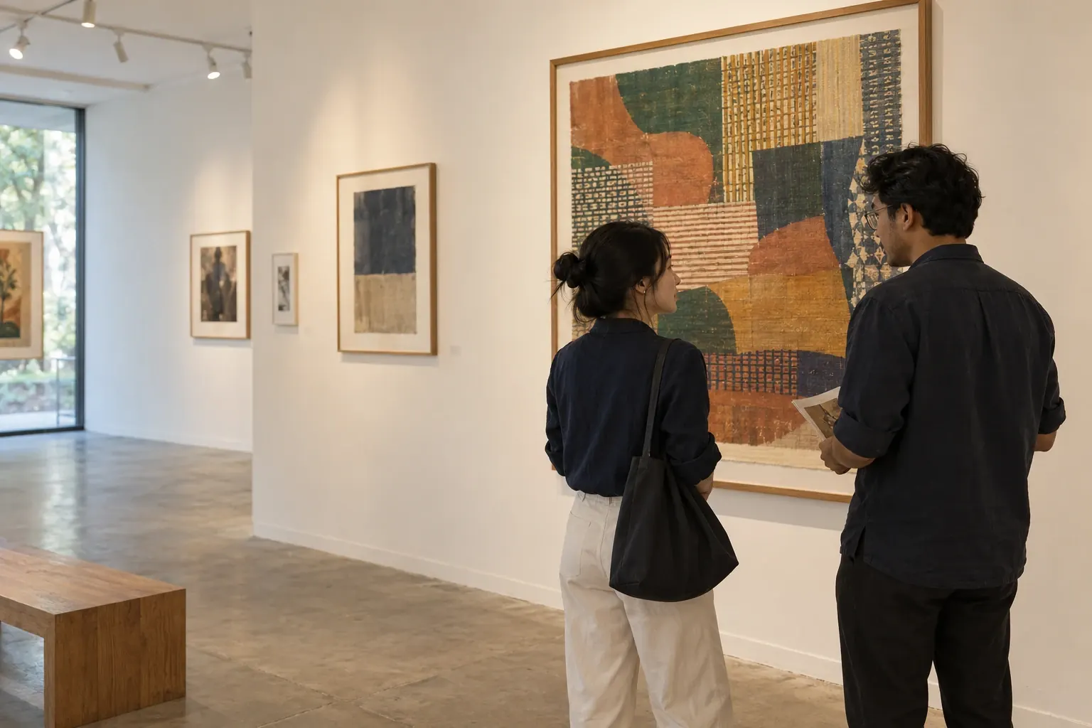
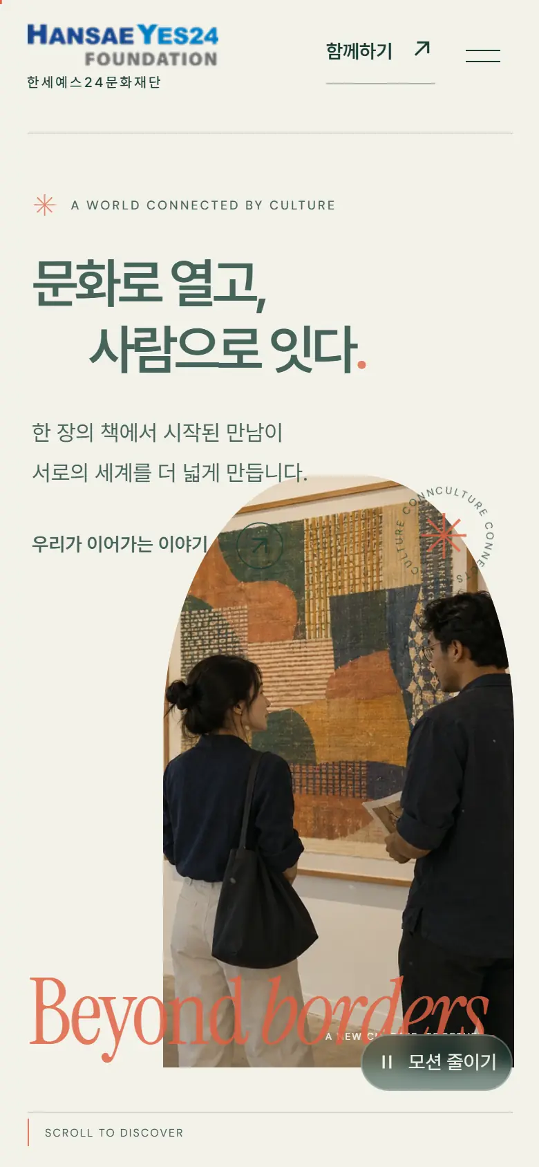
It is a direction that opens brightly, like opening a page of a book. Within the arch of the first screen, two people view the work together. As you scroll down, the arch expands across the screen, and the 8-second video moves back and forth as you scroll. The four projects are flipped horizontally, with cultural stories and news placed one after another below them.
Among the scenes in Proposal A, I chose a moment that I put a lot of effort into directing. Click on the photo to see a larger view of each scene.
Within the arch of the first screen, two people view the work together. Below, Beyond borders is written in large letters.
As you scroll down, the arch expands to cover the entire screen, and “Different Cultures, One Tomorrow.” appears above it.
The gray letters become darker word by word as you scroll, and only “Connecting” changes to coral.
Four ways to share culture are shown in cards that flip horizontally. The first card is ASEAN cultural exchange.
Future growth in humanities is sage, and Uidang Love Sharing is pink. A color was chosen for each business.
The fourth card is the Hanse classic Lied. The wood color of the concert hall was transferred to the card background.
In the cultural story, “Cigarette Girl” and “Winterreise” were placed side by side in different sizes.
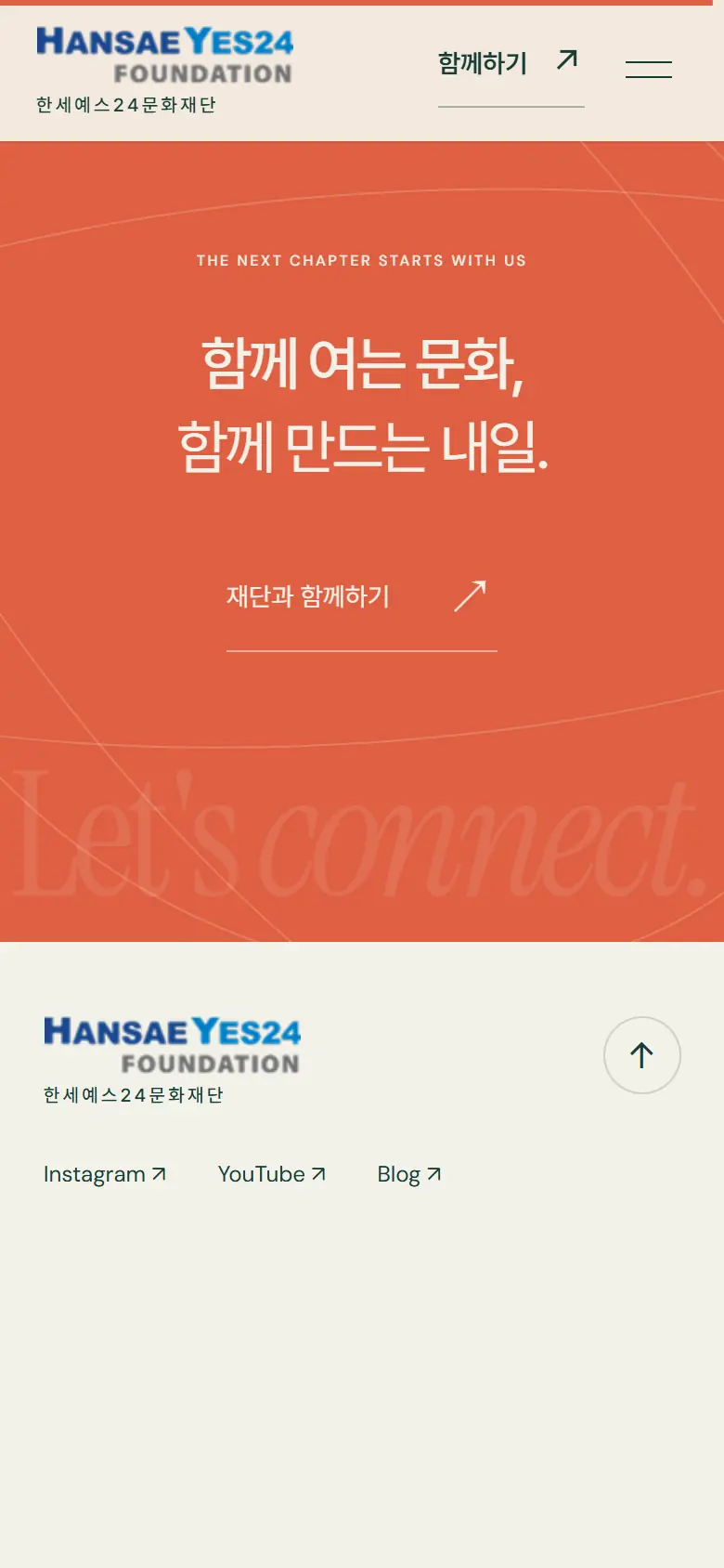
The last scene shows Let’s connect. in large letters on a coral background and guides the way to join the foundation.
BEYOND BORDERSCovering the bookshelf
A single threadFollow the thread into the night
This is the direction in which a strand of gold thread passes over the indigo cloth of the night. As you scroll down, the thread passes through the batik pattern, the exhibition hall, the open book, and the piano in the performance hall, one by one, until it reaches the horizon above the sea. This is a scroll film that connects five scenes from The Foundation with a single thread.
Among the scenes in Proposal B, I chose a moment that I put a lot of effort into directing. Click on the photo to see a larger view of each scene.
This is the first scene where a strand of gold thread passes over an indigo cloth. The thread flows to the right of the screen, leading to the next scene.
The thread passes through the batik pattern and stands in front of the hanging in the exhibition hall. One short text changes each chapter.
After passing the book, you will come to the piano in the concert hall. Gold threads bend like a melody on the piano.
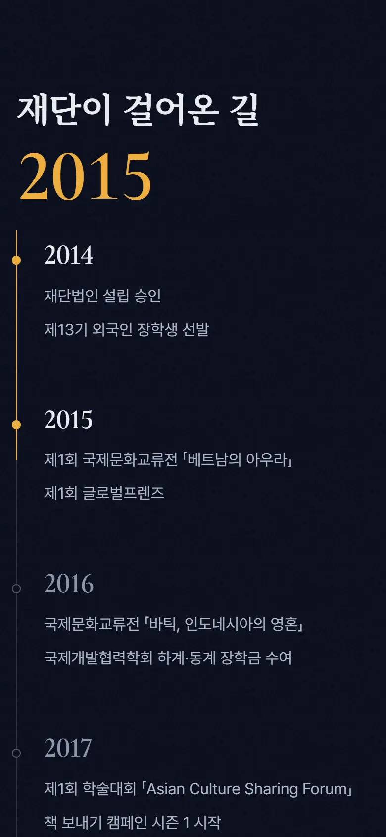
The number of launches in 2014, 7 exhibitions, 7 series, and scholarship projects was spread out on a single strand of thread.
The exhibition posters were hung in chronological order on a strand of thread. Vertical scrolling changes to horizontal movement.
The seven books in the series rotate in a circle, and the introduction of the previous book changes from the left.
The performance venue is visible within four letters of Lied, and as you scroll down, the letters become larger and the venue opens.
The large years on the left scroll from 2014 to 2026.
The first picture in Proposal A was a paper door with bookcases curved in layers to form an arch. During the internal review, it was decided that the foundation's work was closer to an actual encounter at an exhibition hall than an imagined landscape, so the first screen was changed to a scene of two people looking at a work of art together. I kept the arch shape and the three colors I chose from the picture.
For the first scene in Proposal B, I first drew six scenes representing thread, batik, exhibition, book, music, and tomorrow. The composition was adjusted so that the end of the previous scene coincided with the beginning of the next scene, and a strand of gold thread passed through all the scenes, making it into five videos.

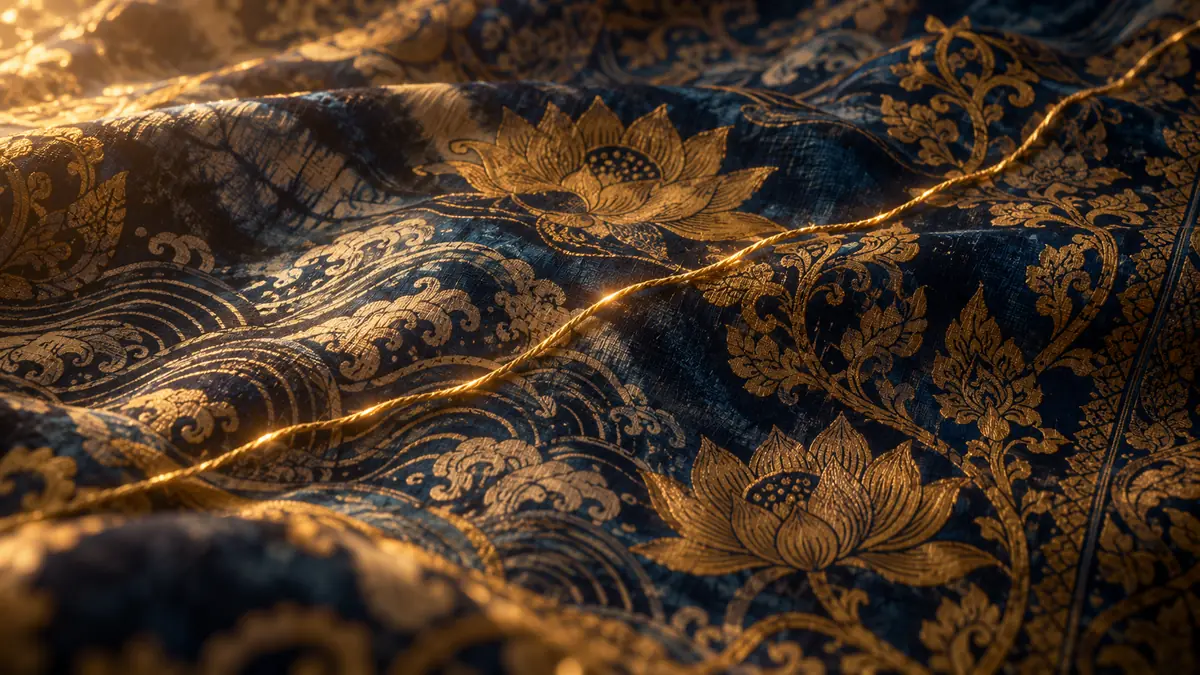
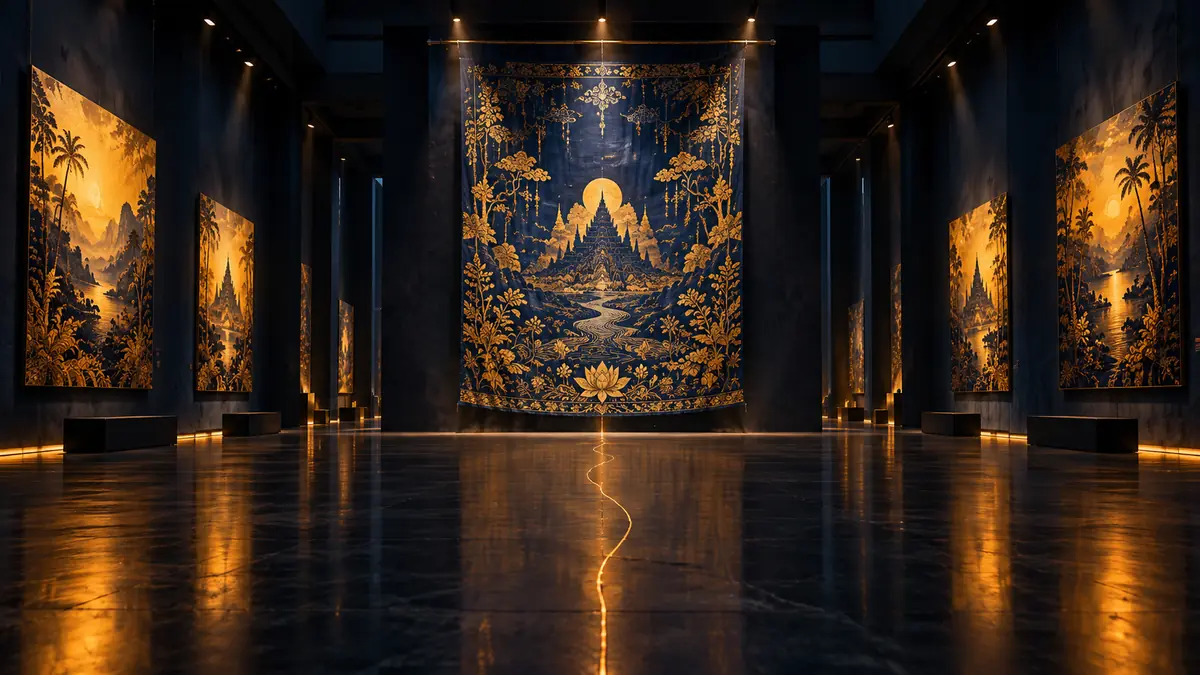

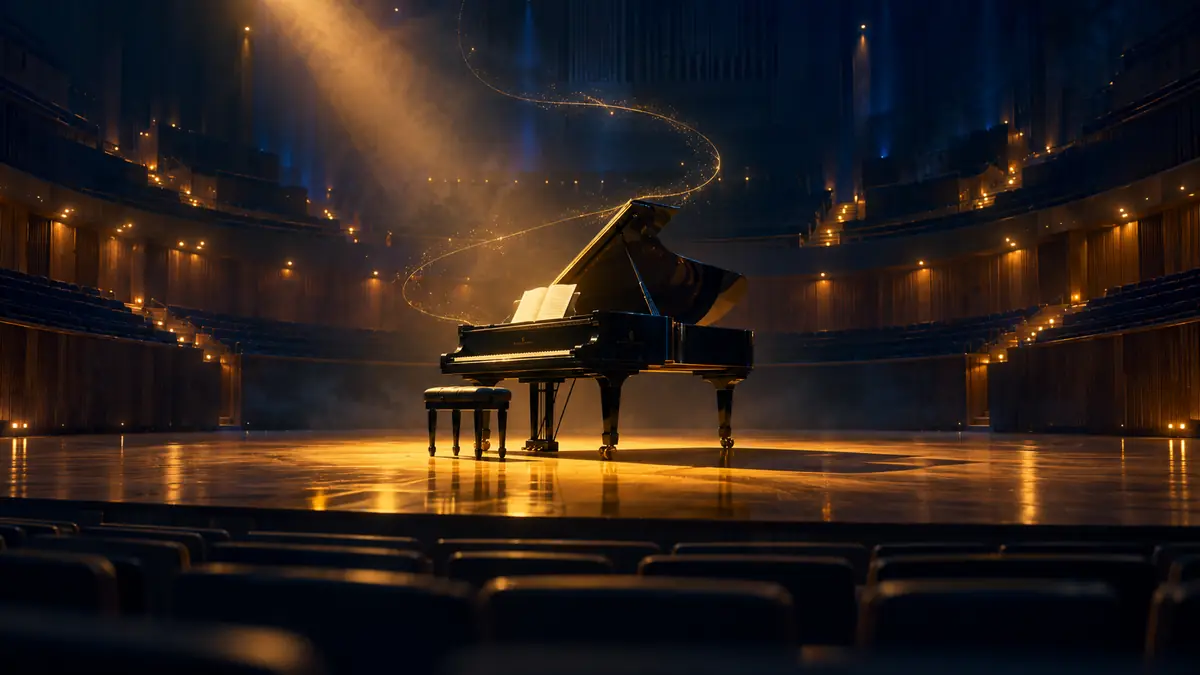

It is a film where a single golden thread passes through thread, batik, exhibitions, books, and music and reaches the horizon. In the design, the film is flipped back and forth according to the scroll position.
This video adds camera movement and subtle changes in light to the exhibition hall scene. In the design, the arch moves along the scroll while widening.
I often check contest news and performance information on my cell phone. Proposal A re-adjusted the Arch home screen to a vertical ratio on mobile and stacked the four projects that had been flipped horizontally vertically. For Proposal B, a separate film was made with 237 frames exclusively for the vertical screen.
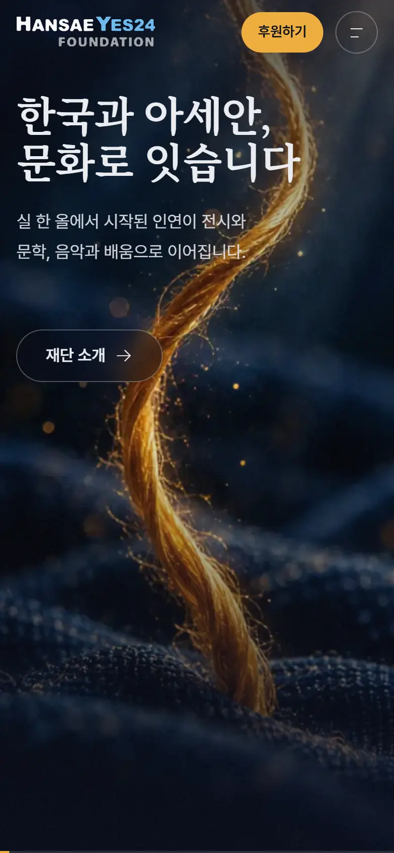
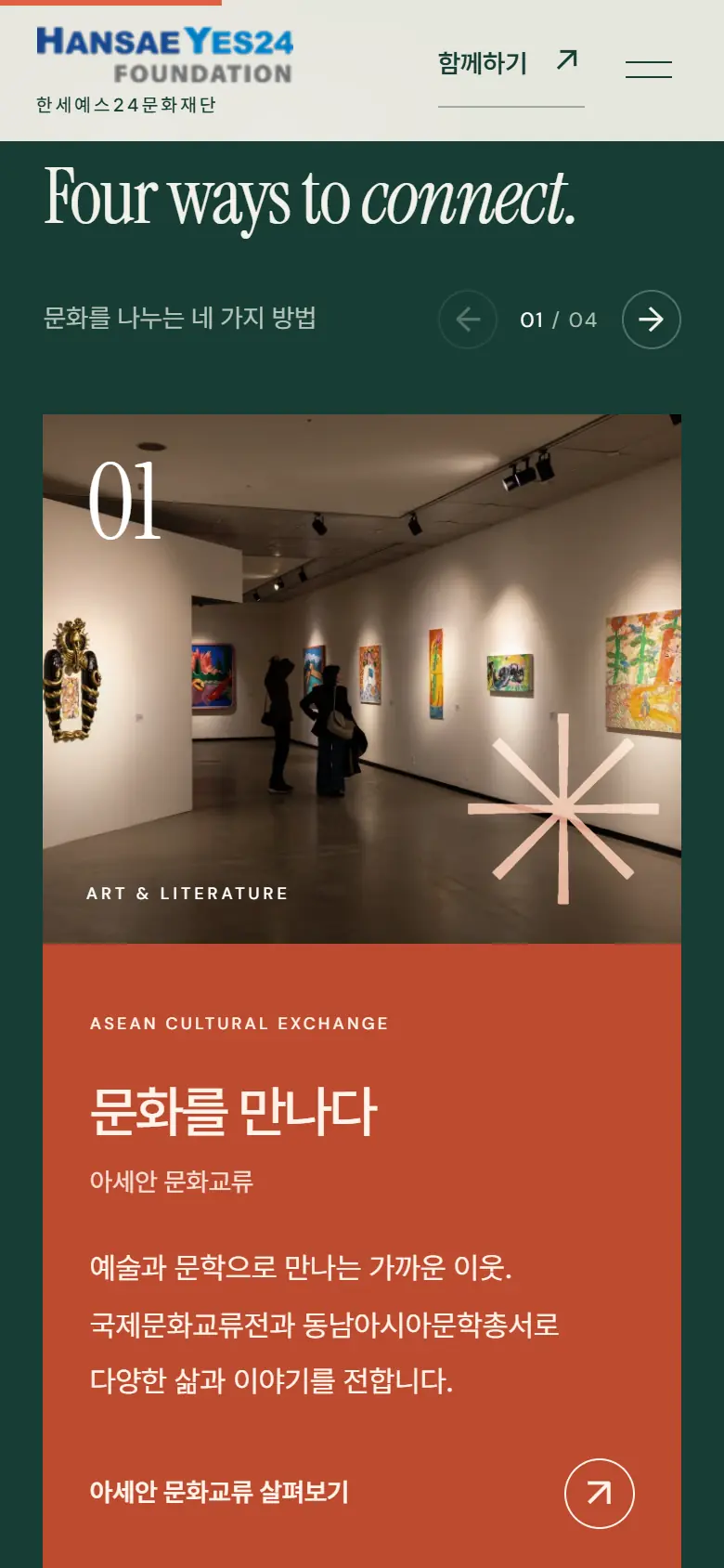
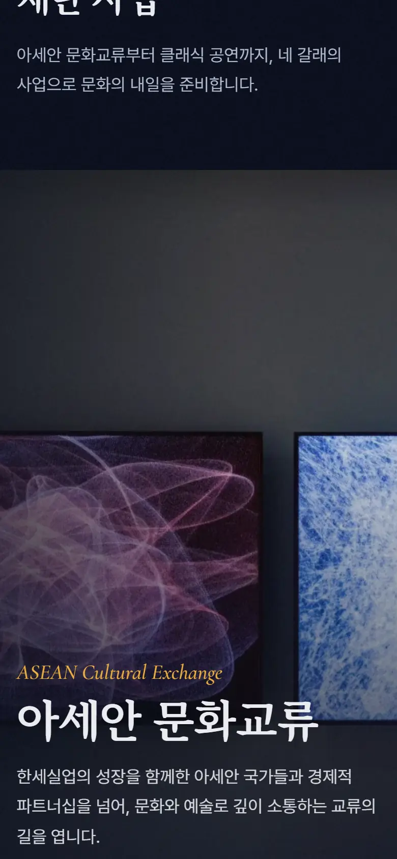
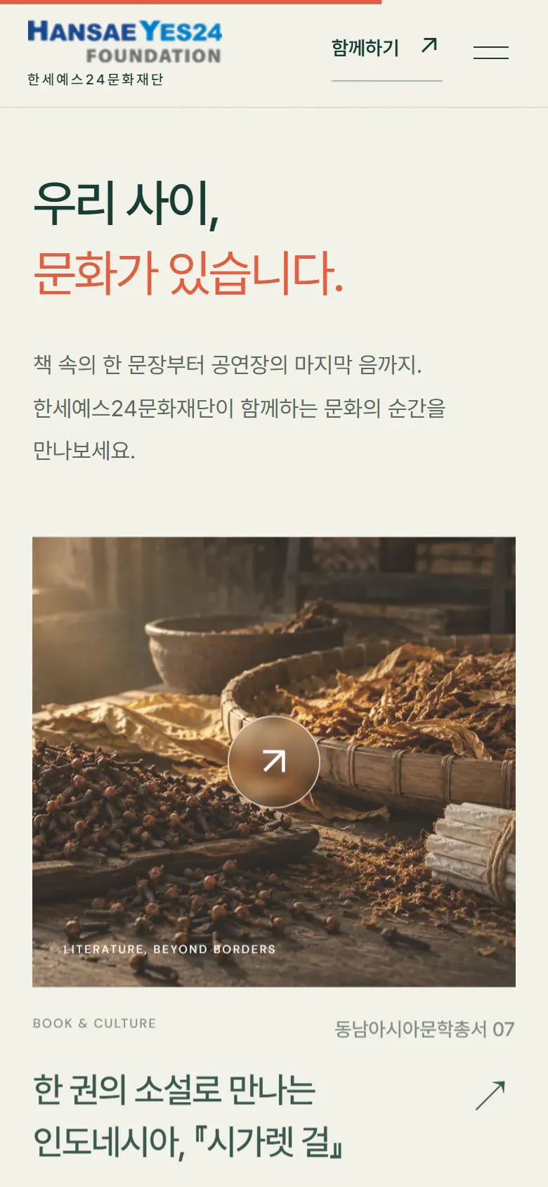
The two designs contain the same content, but what they say on the first screen is different. Proposal A provides a quick overview of the foundation's projects on bright paper, while Proposal B takes you deep into the records the foundation has built up, following a single thread. We've organized the differences so that the foundation can choose based on the scene they want to convey first on the first screen.
WOVEN LABEL
Hansae YES24 Foundation website renewal proposal · Beyond Borders · One Thread
I will start by organizing the order in which the records accumulated in various fields, such as exhibitions, books, scholarships, and performances, will be presented.
 Art · Agency
ENART
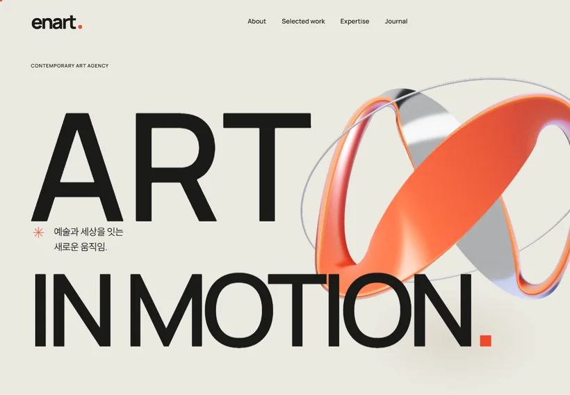
A website renewal proposal for a contemporary art agency. The brand reading starts from the discovery that the logo is printed in cyan and magenta process inks. It includes an analysis of 23 public portfolio projects by type of work, a scene order built from the beginning and end of an exhibition, day and night palettes, two proposals, ART IN MOTION and PASSAGE, and a scroll film that passes a 3D ribbon and four frames.
 Foundation · Nonprofit
Purme Foundation
A website renewal proposal for a nonprofit foundation. The brand reading starts from the three trees in its symbol. It includes blue and sprout-lime colors, accessibility standards and four proposals.
 Media · Publishing
Munhakdongne Publishing Group
A website renewal proposal for a publishing group. The brand reading starts from “dongne,” the word for neighborhood in its name. It includes colors from paper, ink and bookmark ribbon, four proposals, and experiences for browsing books and reading serials.
Contact
Tell us where you are and what you want to achieve. We’ll outline a practical scope, process, and estimated budget.
DIRECT
Your inquiry has been received. We will reply within one business day with a scope and an estimate.